
3 Case Studies: Creating a Mobile Checkout Flow That Makes You Money
Getting a customer through the checkout is one of the biggest challenges online retailers face.
There’s a lot to be said around optimizing your checkout flow and making sure you’re not losing any customers in this crucial step. (We’ve written extensively on this topic, and you can read some of those articles here and here.)
But today, I wanted to focus on an ever growing concern for retailers: mobile checkouts.
All of our optimization efforts for desktops will usually fall short on mobile devices. This makes optimization important as more and more customers use their phones to buy products.
Mobile checkouts are special because we have limited screen real estate and users have even less patience with sub-par browsing experiences than they do on desktops.
Let’s take a look at some of the best retailers in the world and analyze their mobile checkout experiences for some do’s and don’t’s.
1. Amazon
Amazon is arguably the best online retailer in the world (for better or worse). We won’t worry about the experience of selecting products (though that can be an issue in and of itself) and we’ll start from the shopping cart.
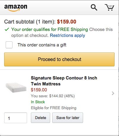
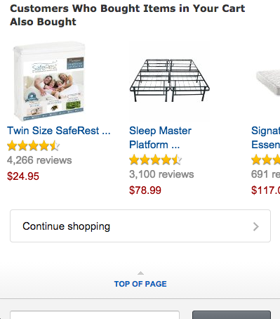
We see the cart sub-total as the very first line and an offer about free shipping. We can also see the item in our cart, all before needing to scroll down the page. Once we scroll down, we see similar items (upselling opportunities), a search box and a footer menu with relevant links, like a reminder to log in with our account.


Notice that any buttons on this page are quite large, making them easy to tap on any mobile phone. After proceeding to checkout, we are asked to log in or create an account. Both screens are quite simple, with 2-4 input fields at most. Smaller retailers should offer to checkout as a guest, but Amazon can afford the luxury of forcing users to create an account.
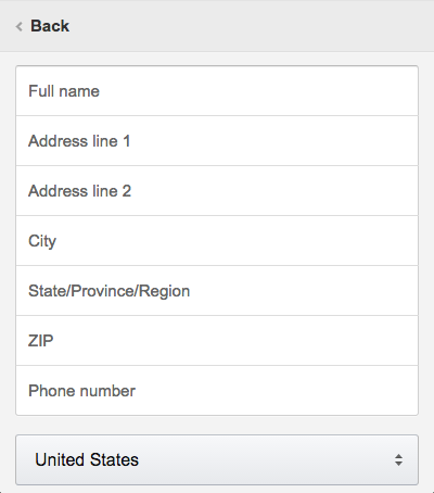
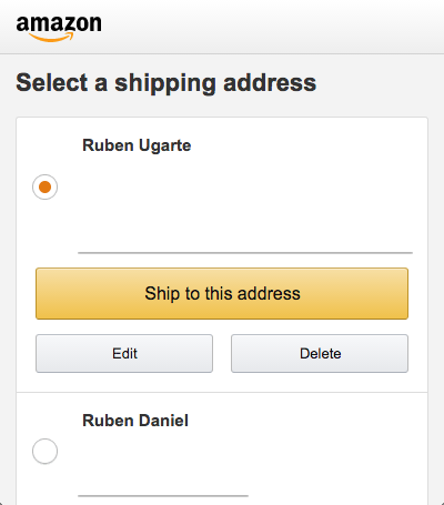
After logging in, we have to select a shipping address for our order. Once again, we see large buttons pointing us to key options. Adding a new address is also quite easy, especially with the mobile friendly inputs. Inputs on mobile devices should be large and easy to click.

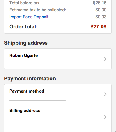
In the last image, we can see the big yellow “Place your order” button that will finish our order. We can also scroll down and see a summary of our order information. You can’t see it, but boxes like the shipping address and the payment method are clickable and will take you to another page where you can edit this information. This is a good approach that gives users the option to edit their information, but doesn’t require it. This last screen should only have one large button and that is the button to finalize the order.
2. Asos
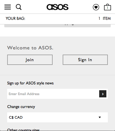
Asos is one of the biggest UK clothing retailers, though they are slowly becoming more popular in the United States and Canada. Once again, we’ll start from their shopping cart which they call “Your Bag”.

We instantly see our item and the options that we chose (size M and Navy color). We can also see smaller icons to delete our item and medium size buttons to edit our item or save it for later. The next step button, however, is large and orange, making it easy to spot.
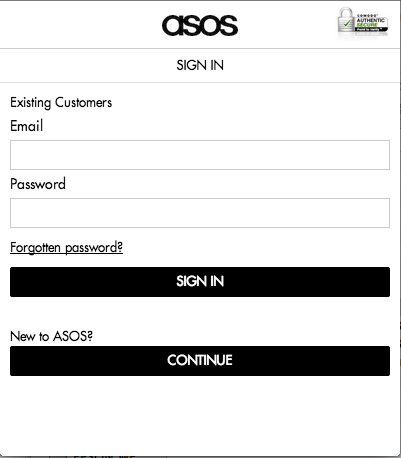
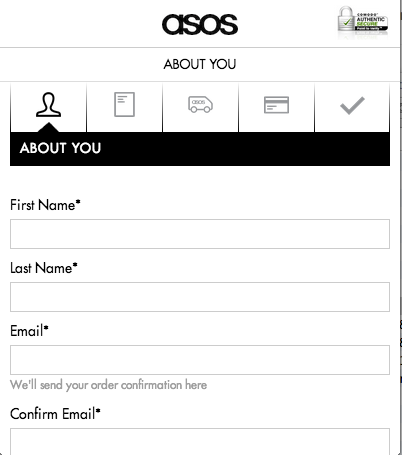
Asos then asks us to log in or to “Continue” if we are a new customer. The continue button is a bit vague and doesn’t really tell us if we have to register or if we can checkout as a guest. This page contains nothing else besides the login boxes and a secure checkout image at the top.
In the second image, we see that “continue” for Asos means that you will register for an account and we now even see a progress bar, where we will also add our payment method. Asos could perhaps let users checkout as guest and then simply ask to create an account later, minimizing the need for so many fields right now. Either way, let’s proceed on our checkout process.
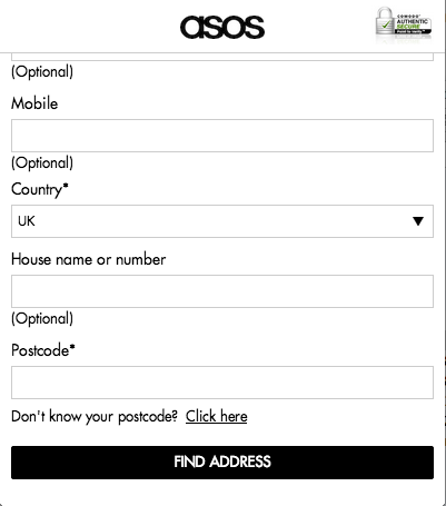
In the next step, we fill out our billing address. The inputs are nice and large but the next step button is black, which is different from the orange one we saw back in the shopping cart page. It would have been nicer to keep that consistency going through all the checkout pages. There is a nice “Deliver to this Address checkbox” in the bottom of this page. This will save us the trouble of entering our address twice, though Asos could make the option more prominent on the screen.
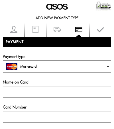
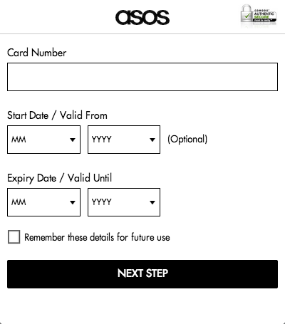
The payment screen is pretty easy and we can see that we were able to skip the shipping address page by checking the box in the last screen. The payment inputs seems larger than the other inputs which is good, though perhaps they could make all the inputs this big.

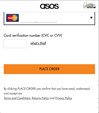
The last page is a summary of our information, though its missing a “Place your order” button at the very top of the page. I have to scroll all the way to the bottom to find it, which is a bit annoying especially if I’m an existing customer and I know that all my information is correct. Once again, the “place order” button is orange.
3. Ebay
Let’s now look at Ebay and see how they handle mobile users. Ebay doesn’t really have a shopping cart, and you have to buy one product at a time, but that’s ok because they are an auction site, after all. We’ll start with the purchase screen for a sample product.
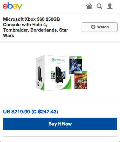
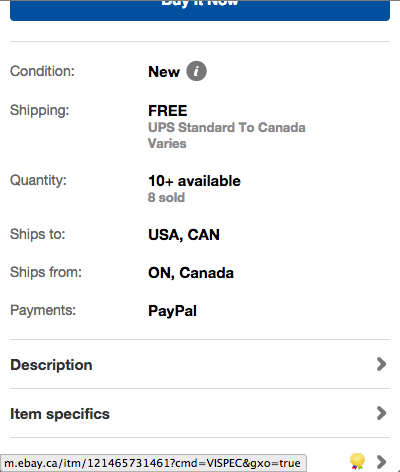
We are instantly greeted with the most important information including the title, price and a big “Buy it Now” button. Scrolling down the page shows the other key information about this product including the condition, where the item is shipping from, and links to other areas, like the description. We also see that this page has two “buy now” buttons (top and bottom of the page), and this is pretty consistent across any product page. Even if you visit the description section, you will see still see the two big buy buttons.


After clicking the buy now button, we are taken to the login page. Ebay does offer an option to checkout as a guest, which is great. The register option is quite small, but that’s probably because the guest option is easier to complete on a mobile device. A minor point is that Ebay removed any unnecessary menu links, such as the search icon, to make it harder for a user to get distracted.
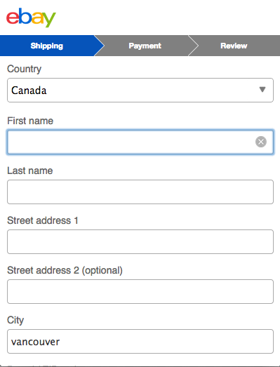

Checking out as guest is as simple as it gets. We have a nice progress bar at the top of the page, with a max of 3 steps. The inputs on this page are also quite large and Ebay is keeping the number of fields to the minimum. Ebay is also keeping the blue button consistent throughout their checkout pages, which is a great way to let users know what the “next step” button is.

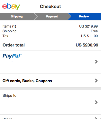
Ebay uses Paypal for all of their transactions, so the last page is a mix of Paypal and Ebay elements. We have a very simple payment page and an option to log in to Paypal. Note that this isn’t the last step, since the button for the next page says “Continue”. In the last page, we can see a review of all of our information and, just like Amazon, the white boxes are clickable. The “Place Order” button is at the bottom of the page, though perhaps it could also be at the top of the page.
As you can see, mobile checkout experiences can be very similar but they can quickly become annoying with questionable design choices. Do you have any other tips or companies that have great mobile checkout experiences? Let me know in the comments.
Ruben Ugarte
Ruben Ugarte is a Web Analytics Consultant who has helped companies of all sizes grow through the use of analytics. If you have any questions around how you can use analytics or even how to use tools like Mixpanel or Segment, get in touch with him!
Tagged checkout, mobile checkout
Featured Image By: Johan Larsson. Licensed under CC BY 2.0.


