
Improving Your Checkout Experience Through Case Studies
As online retailers, we are constantly thinking of ways to increase our sales. We have an unlimited number of options and deciding on the most cost effective solution can be hard. Today, I want to cover one of these solution: checkout optimization.
Optimizing your checkout process can be one of the easiest ways to increase your sales in the short term. There are tons of articles here, and here on how to improve your checkout conversion rate so I wanted to take a different approach.
I decided to take some of the most popular online websites and dissect what makes their checkout experience great. The two companies that I will be looking at are: Amazon and Fab.com.
Both companies really understand how to make e-commerce work and this is apparent when taking a look at their checkout processes. Let’s get started with Amazon.
Amazon:
![]()
I started my shopping experience by looking at a DVD about Superman. Amazon has a great product page layout which we can cover in another blog post. For now, let’s focus on their action buttons which are always an orange-yellow colour.
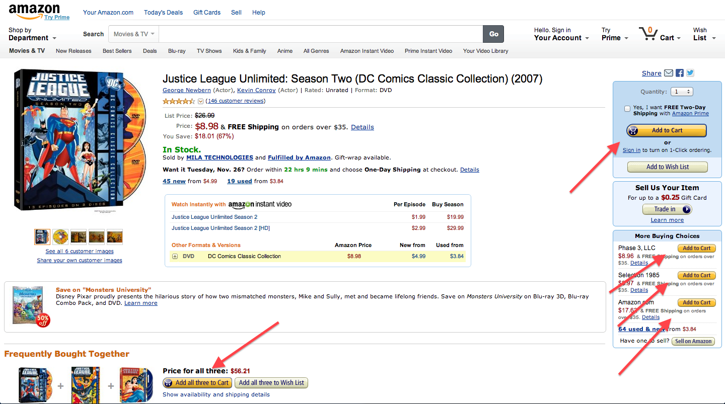
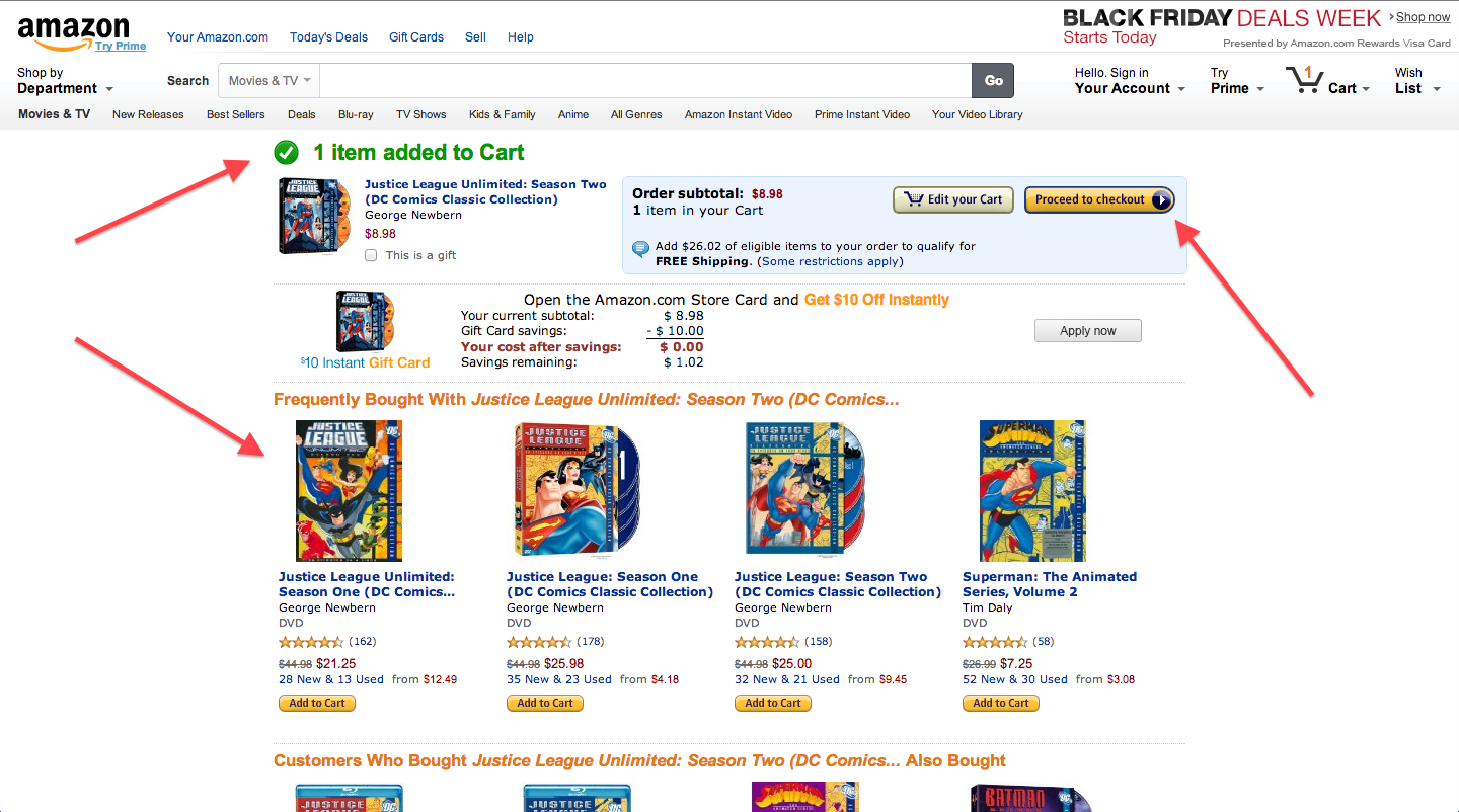
After clicking the “Add to Cart”, I get taken to my shopping cart. A big green title lets me know that the product was added successfully. I also see a lot of recommendations for similar products and we can see another action button directing us to “Process to Checkout”. There are a ton of other up selling opportunities that Amazon uses really well. Take a second to look for any other sections that are designed to get users to buy more items.
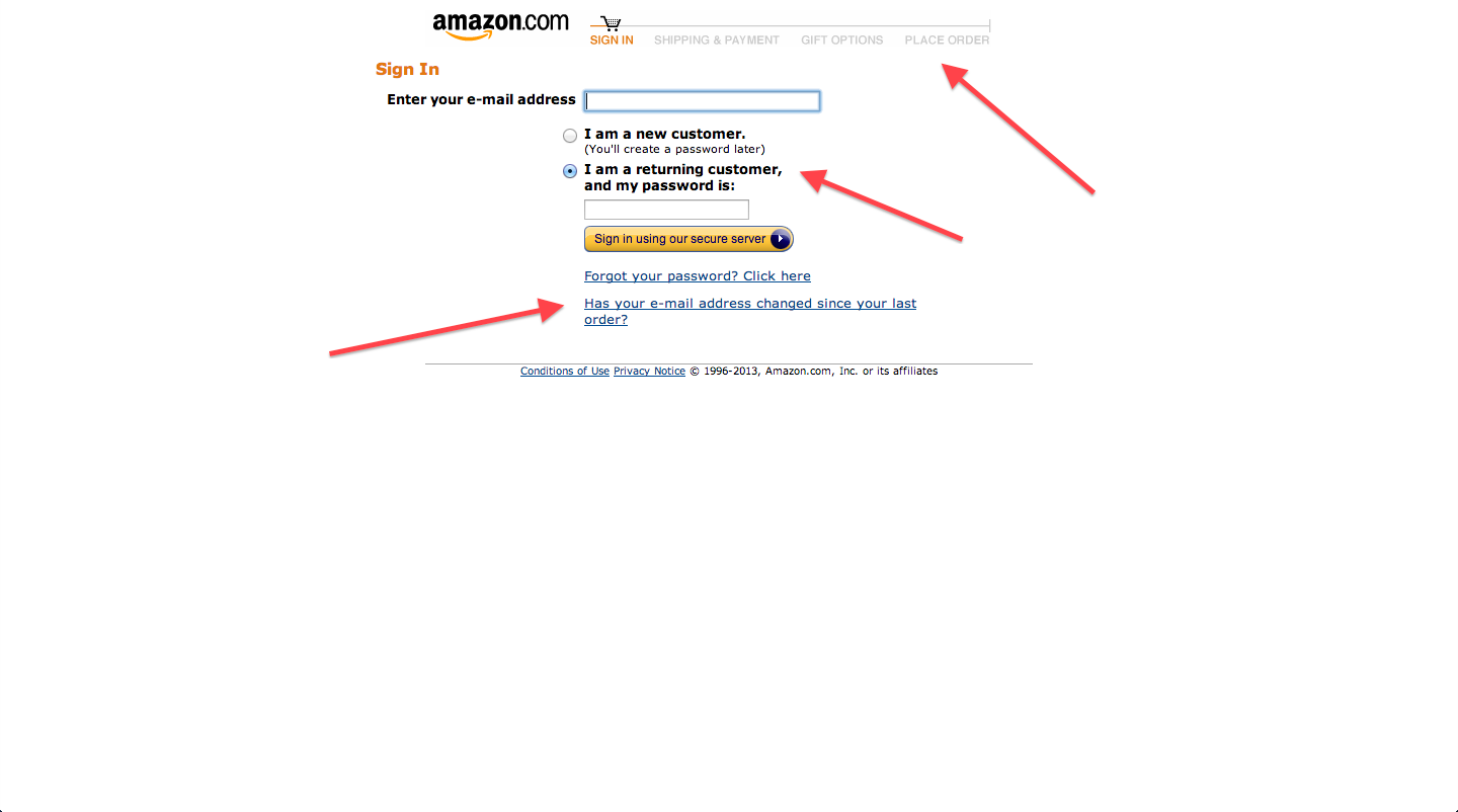
After clicking “Proceed to Checkout”, I’m greeted with a screen asking me to log in or create an account. A simple option let’s me choose if I’m a new or returning customer. The text is also very clear, leaving very little for the user to assume. I can also see all the steps in the checkout process and where I am right now.
Finally, notice how there aren’t any menu buttons in the checkout pages. You can’t browse other products or other pages. It’s very focus on helping the user purchase their items.
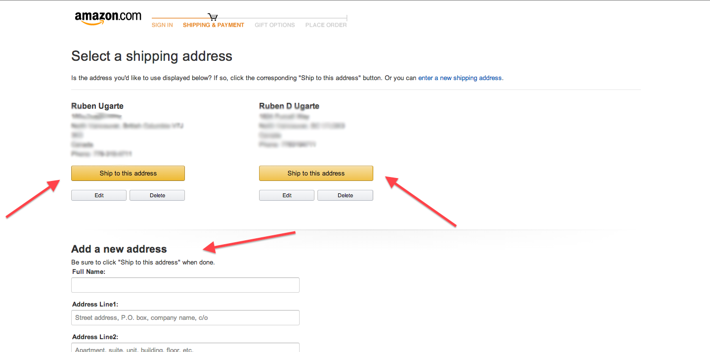
The next step in the checkout process is the “Shipping and Payment” option. If you’re a returning customer, you will have an option to choose an existing address. The “Ship to this address” button is the same colour as previous action buttons. You can also enter a new address below.
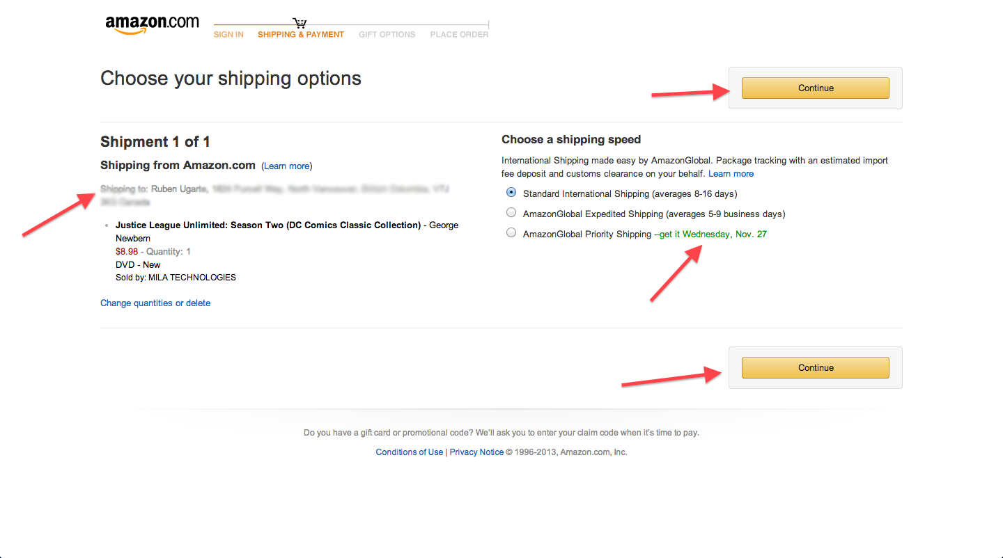
After choosing an address, I get some extra shipping options in the next screen. The shipping options are typical but notice how they emphasize the third option with a green text and a clear benefit.
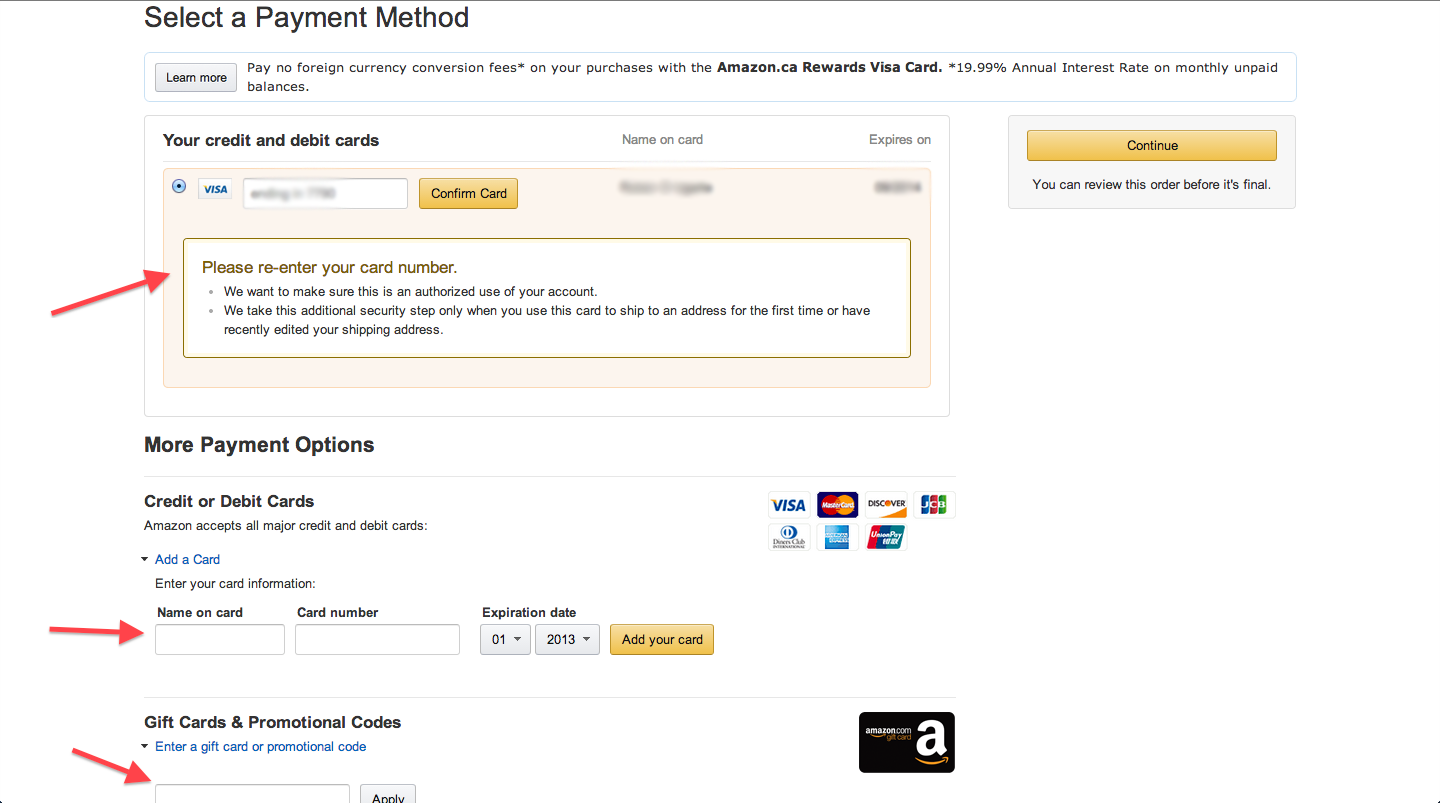
The next screen is all about the payment method. There are multiple options but you can complete everything without leaving the page. This is great because you don’t want your users to leave your checkout to do basic tasks like editing their credit card information.
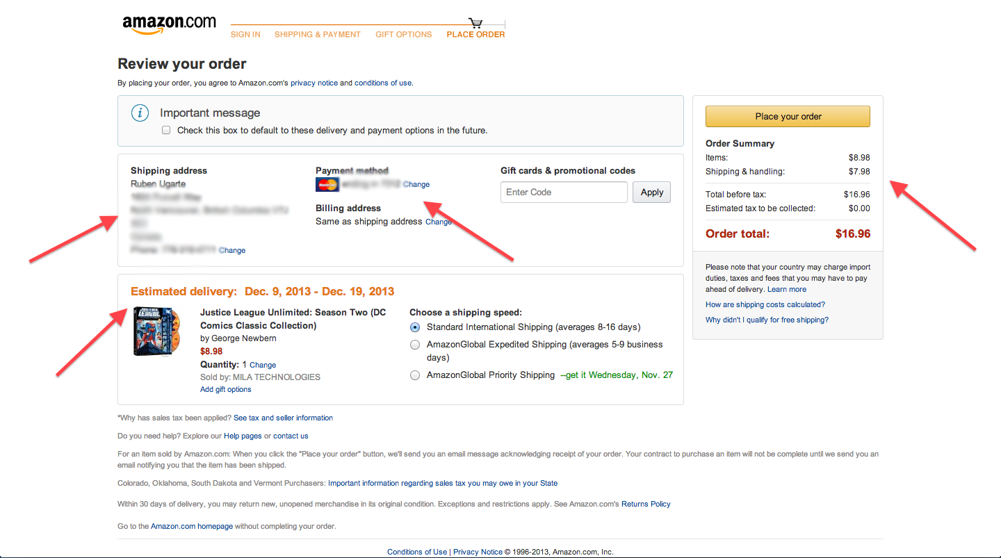
I arrive at the final screen where I can see all my options and double check everything. I even have the ability to edit certain aspects of the order in a couple of clicks. In the whole page, there is only one yellow-orange button and that is the order to place the order.
A summary of the best aspects of the Amazon checkout experience:
- Consistent use of action buttons e.g. “add to cart”, “ship to this address”.
- Checkout pages don’t have any unnecessary menus or links. It puts a big focus on helping users complete the checkout process.
- Every page had one single purpose e.g. choose an address, choose a shipping option, choose a payment method.
- Menu at top provided an idea of how many steps are in the process and where you currently are in that process.
Fab.com
![]()
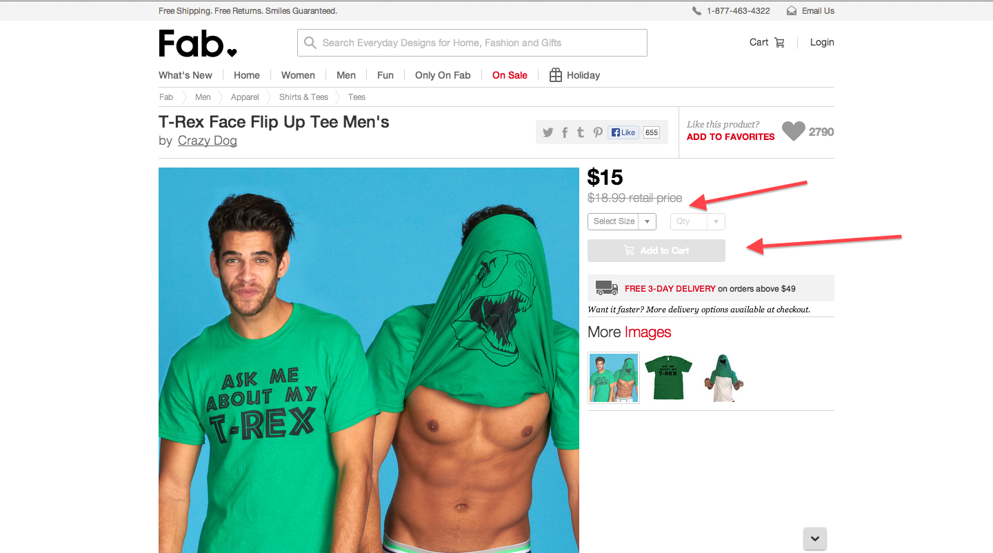
Let’s now take a look at another popular online retailer, Fab.com. I started by selecting a funny t-shirt that I think would look great on me. Fab has a typical product page but it’s interesting to see how they disabled the “Add to Cart” button by default.
They probably realized that users might be selecting the wrong size before adding it to their cart and decided to force users to select a size before making it possible to add that product to your cart.
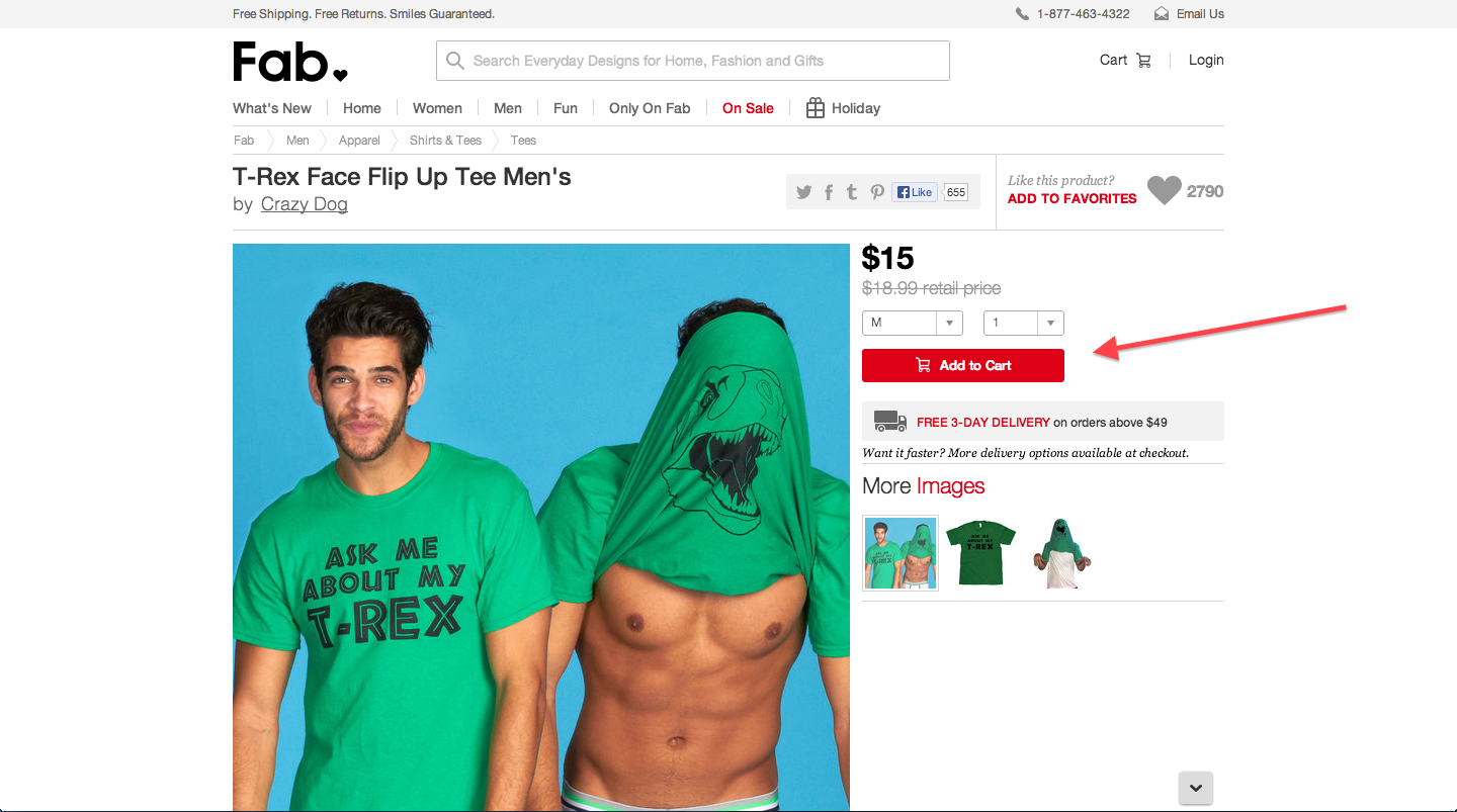
Once you select a size, the red “Add to Cart” become available and we can click it. A small cart pop ups for a few seconds letting us know that the product was added successfully.
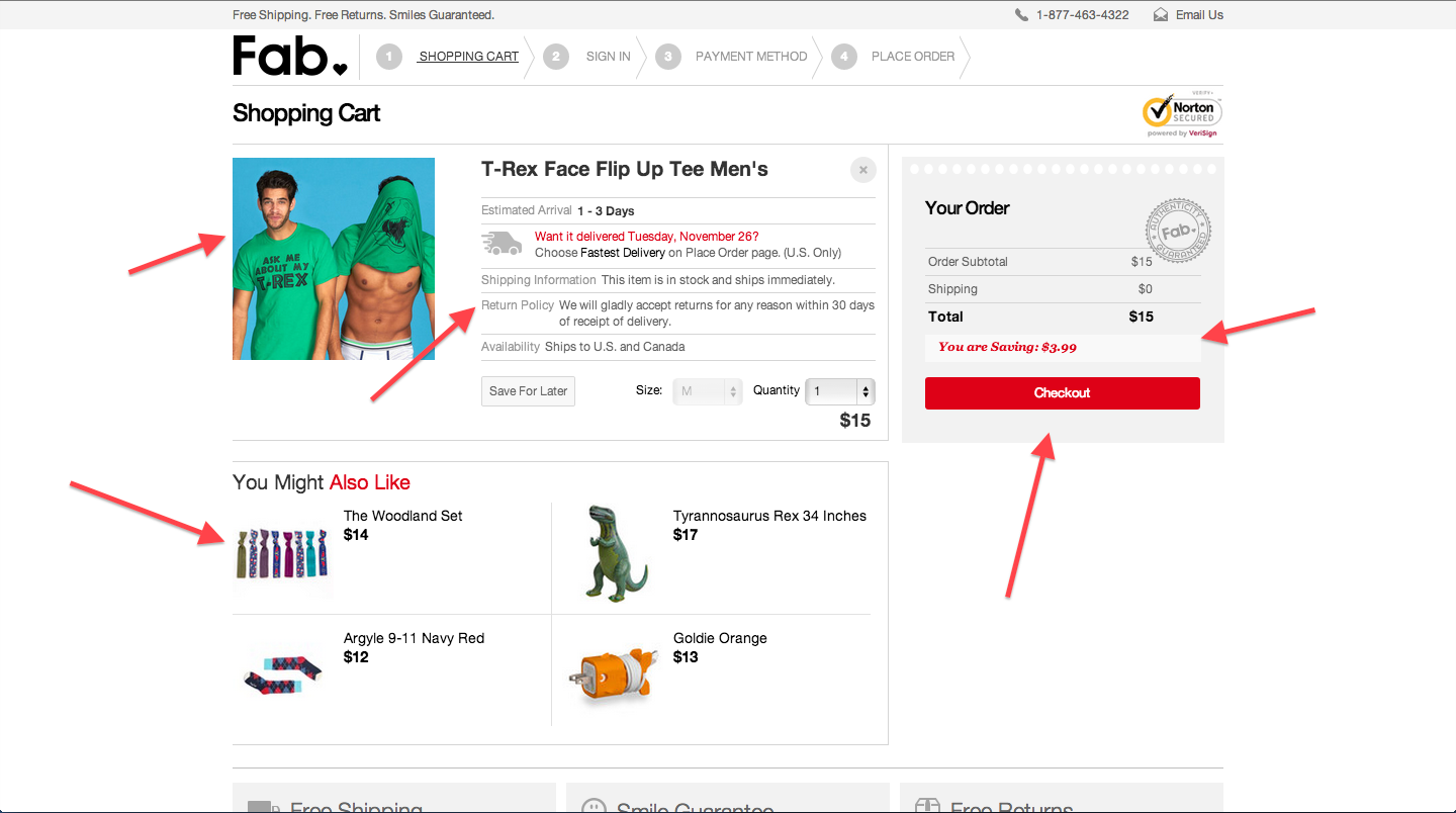
We can then visit the shopping cart page to start our checkout process. We again see that the action buttons are red and will always be red. The shopping cart also displays some useful information about the product confirming that it is in stock and their return policy. We click the “Checkout” button to continue.
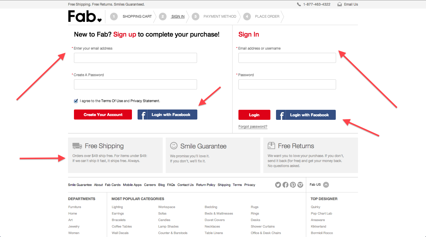
We are then greeted with an option to log in or create an account. It’s also easy to log in with Facebook if you don’t want to create an account. Creating an account is just as easy as signing which is a nice touch. I created my account and continue on to the next step.
In the next screen, we get a nice pop up letting us know that we need to confirm our email address to be added to their mailing list. We can complete the checkout without confirming our email though. This could be a bit confusing for new users who think they need to confirm their email to checkout.
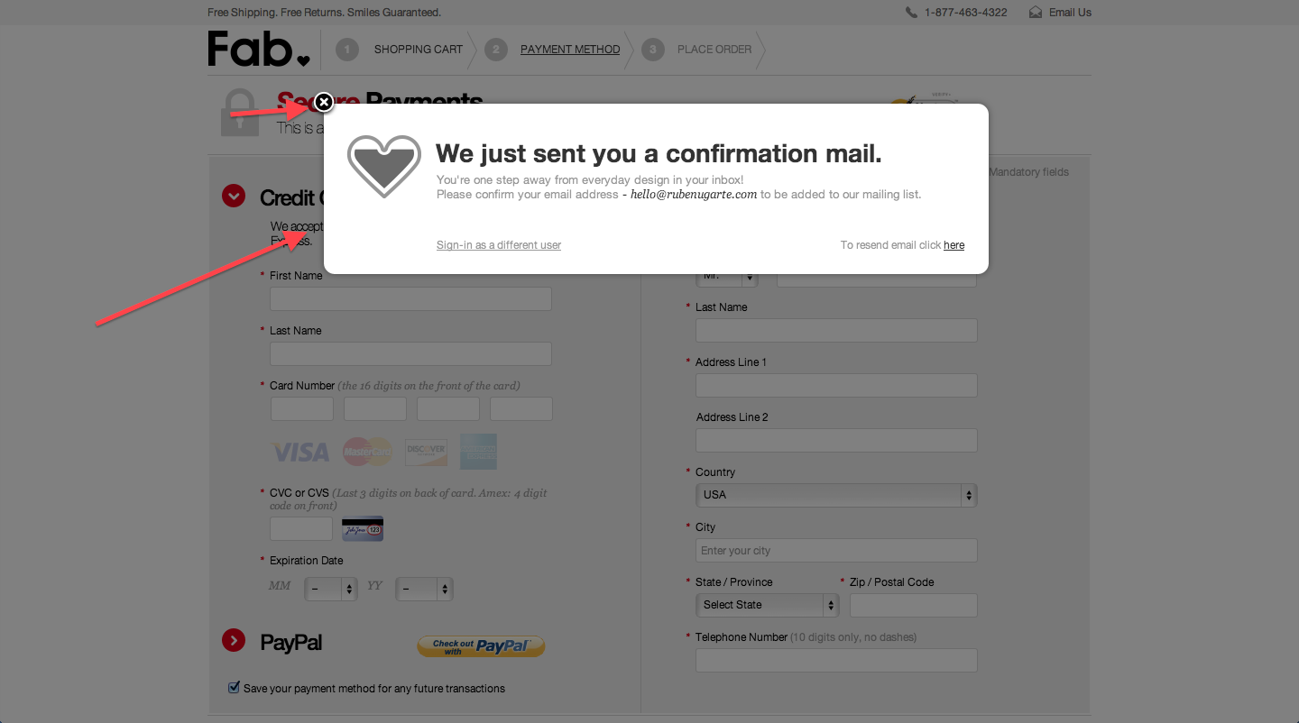
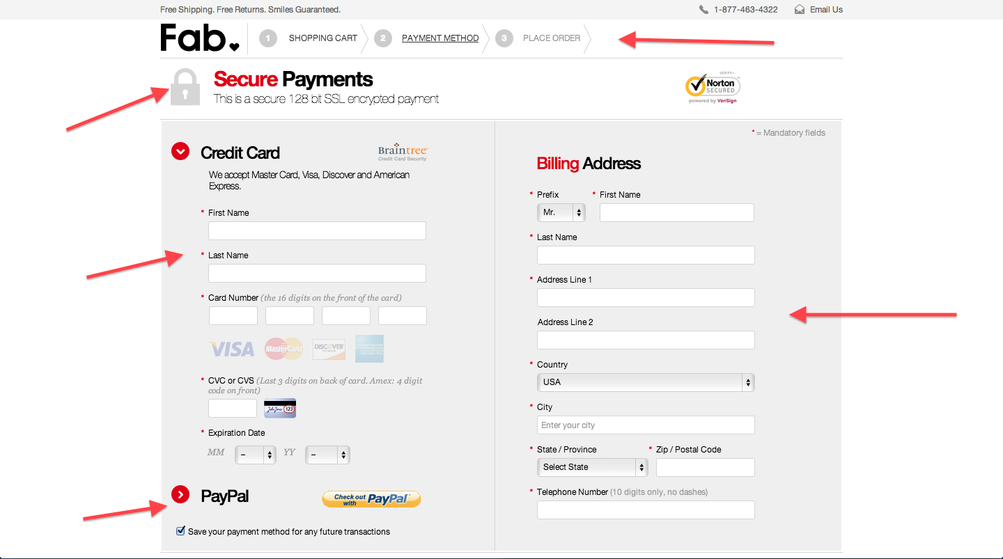
After closing the pop up, we can see what their checkout pages look like. At the top, we can see the checkout steps and where we are. It isn’t as clear as Amazon’s but it does the job. We then see some security benefits before we enter our credit card data. Then we have the option of entering our credit card data and billing information in one single page.
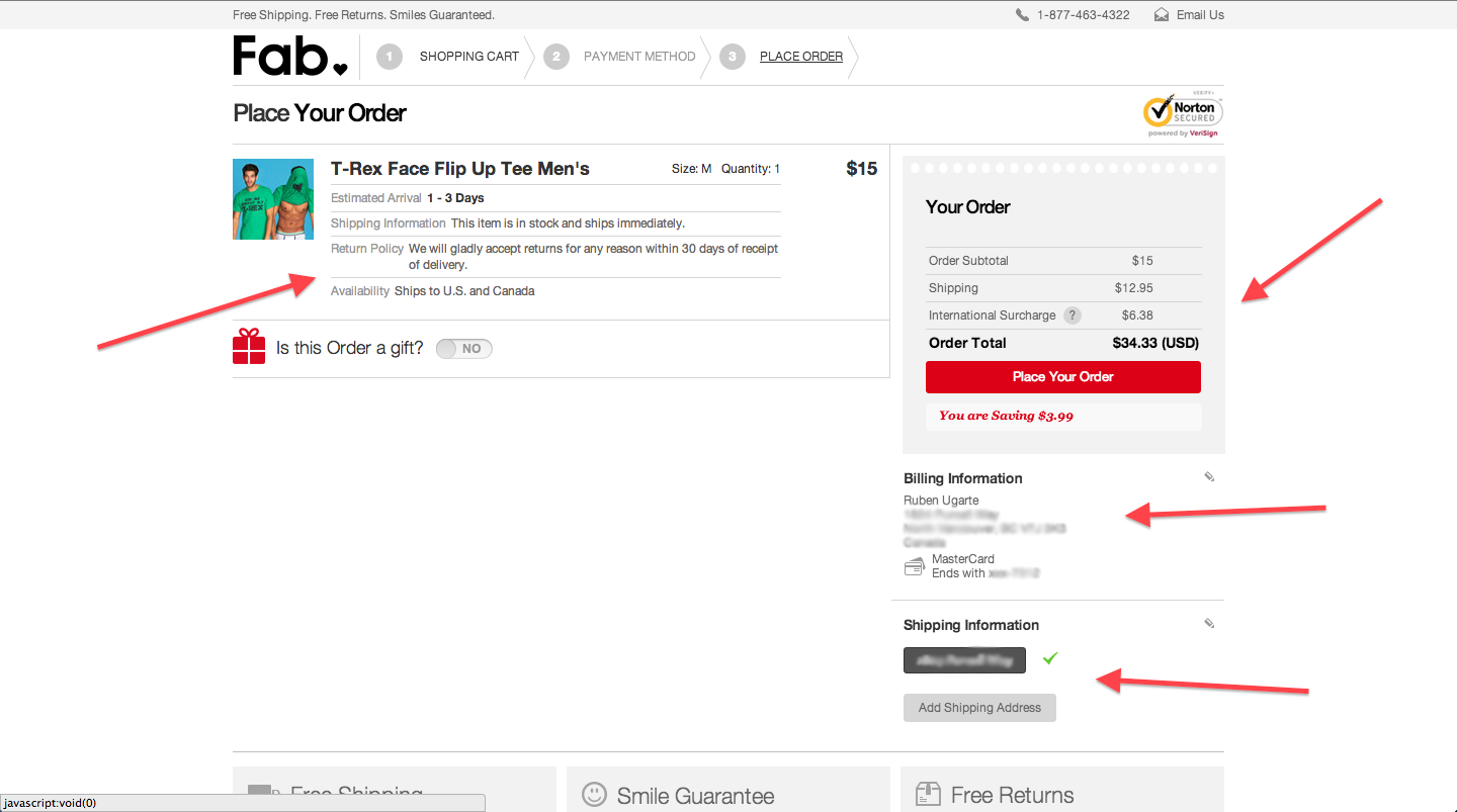
After entering our information, we get taken to the last page in the checkout process. We can see a summary of our information and the ability to quickly edit some sections. Finally, the big red button allows us to “Place Our Order”.
A summary of the best aspects of the Fab.com checkout experience:
- Action buttons were consistent and easy to spot.
- It had less pages than the Amazon checkout but only testing could determine if that’s better for conversions.
- Checkout pages removed any unnecessary menus or links.
Overall, both companies have great checkout experiences. What elements could you implement in your e-commerce website? Which small things could help increase your conversion rate?
Ruben Ugarte
Ruben Ugarte is a Web Analytics Consultant who has helped companies of all sizes grow through the use of analytics. If you have any questions around how you can use analytics or even how to use tools like Mixpanel or Segment, get in touch with him!
Tagged cart abandonment, checkout, conversion, Customer Experience
Improve Your Online Checkout Nate Grigg. Licensed under CC BY 2.0.


