Using Color Psychology to Increase Your eCommerce Sales
For eCommerce retailers, persuasion plays a critical role in making shoppers make the buy decision.
And since we are visual creatures, color has a massive influence on our attitudes and emotions, and thus the decisions we make.
Actually, a study done by the Secretariat of the Seoul International Color Expo 2004 revealed that 84.7% of buyers will make the purchasing decision based on the color they see.
Furthermore, our brains process visual content 60,000 times quicker than words.
So, can the proper mix of colors actually increase your sales? The answer is yes.
What is Color Psychology?
Color psychology is basically the study of how color influences the decisions people make. If you understand color psychology, you can capitalize on that knowledge to create brand relevance and accelerate purchases.
It enables you to forecast how shoppers will react to your promotional messages based on the color scheme you are using.
If you want to choose the best color scheme for your persuasion efforts, you need develop a robust vision of your brand, how you intend to penetrate the market, and the characteristics of your target shoppers.
What type of image do you intend to depict? Is it authority and luxury? Is it confidence and cheerfulness? Or, is it purity and efficiency?
Let’s talk color
- Avoid gray, orange, and brown for feminine products. Stick to blue, purple, and green.
Philip Cohen, a University of Maryland sociologist, did a study to find out the colors preferred by most people. In the study, he asked 1,974 men and women to choose their favorite colors, and the results of their color preferences is as shown below.
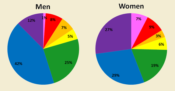 The study revealed that blue is the most popular color for both men (at 42%) and women (at 29%). Women also like purple (at 27%) and green (at 19%).
Interestingly, most women do not prefer pink, as most people believe. Therefore, you may consider limiting its use on your eCommerce website if you intend to appeal to women shoppers.
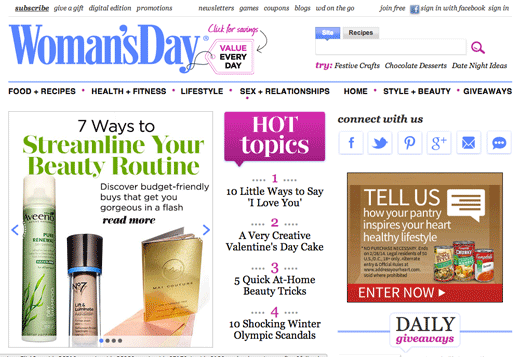
A number of eCommerce websites, whose target audience is primarily women, use this trick. For example, Woman’s Day site has all the three colors preferred by females on their front page.
- Avoid purple, orange, and brown for male products. Stick to blue, green, and black.
If your eCommerce site has products suited for men, then use blue, green, and black. These colors have been customarily associated with the male gender. Surprisingly, most men do not prefer the brown color.
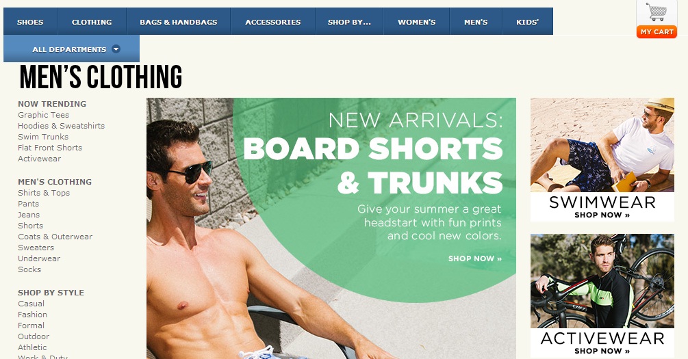
For example, Zappos.com uses masculine colors for promoting its products. Here is a screenshot of the site.
- Black denotes power and luxury.
Existence of black suggests power and luxury. If your eCommerce website is having high-end, trendy items, you will have hit the nail on the head by mixing black with other stylish colors such as gold and silver.
Since black drives a confident vibe to shoppers, it is an excellent color to use if you are dealing with costly and luxury items.
For example, JamesEdition.com, a private jet site, takes things seriously. And, the use of black clearly demonstrates that.
- Use yellow for optimism and cheerfulness.
Presence of yellow color increases cheerfulness and warmth in people. Yellow brings excitement in purchasing items and assist convey a sense of happiness to the site.
As such, you can use this color in sections of your eCommerce site where you want your visitors to explore further, for example, in call-to-action buttons.
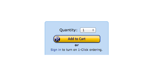
Amazon, for instance, utilizes yellow in its “add to cart” button to great effect.
But it’s important to note that you should avoid using yellow in high doses, as it can strain the eye and reduce the visitors’ engagement.
- Use green to give a relaxing feeling.
Green, the chromatic representation for nature itself, is a color for growth and versatility. It is very easy to the eyes, giving the visitors to your site a more relaxed feeling. The color is also, not surprisingly, common on websites passionate about environmental issues.
When customers see green on your eCommerce site, they tend to feel calmer, and more comfortable and confident when making the purchase decision. Furthermore, green is also closely associated with money, so it leads to thoughts of prosperity.
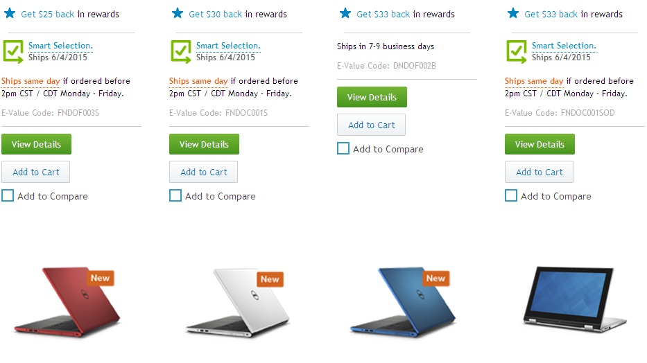
For example, see how Dell utilizes green on its conversion tools.
- Use blue to build customer’s trust.
Blue is one the most common colors on websites. Most people prefer blue because it conveys feelings of trust, serenity, efficiency, and responsibility.
So, if you want your eCommerce site to be seen as trustworthy and efficient for conducting business, use blue in strategic locations for best results.
No wonder, PayPal, a reputable online payment company, uses blue as the theme color for branding and increasing their credibility.
- White is also powerful.
White on an eCommerce site conveys the notion of purity, innocence, efficiency, and breathability. It is primarily used as a background color because it contrasts very well with a majority of the text colors.
Extensive use of white space sends a powerful message to the audience. For instance, the most visited site on the Internet is essentially white in color.
- Orange ignites positive excitement.
Orange is associated with joy and enthusiasm. It has influential attention-grabbing characteristics that makes shoppers excited an engaged.
More so, it’s a fun color that can lead to a feeling of haste or urgency on a site. It is better to use orange sparingly to direct the interest of the site visitors to something. If it is used excessively, it may be overpowering and distract shoppers.
For example, Amazon utilizes orange in their “limited time offer” advert on the top of their site. Orange stimulates a sense of urgency, which makes the Amazon advert more conspicuous and actionable.
- Bright colors are suited for call-to-action.
Several studies have revealed that the use of bright colors lead to high conversion rates. Brilliant colors, such as red, green, orange, and yellow, show vibrancy and ignite activity. So, they capture the attention of shoppers more easily.
On the other hand, darker colors, such as gray, brown, or purple, have a lesser engagement with the customers. Therefore, they usually lead to low conversion rates. eCommerce websites that use bright colors for their call-to-action elements usually record high sales.
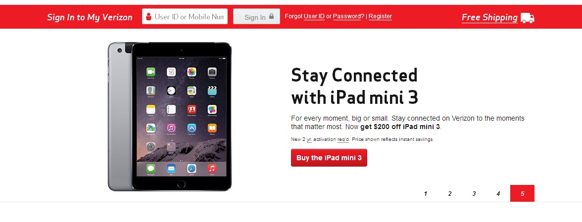
For example, Verizon Wireless, a site selling cell phones and other gadgets, uses red to persuade visitors to click on the call-to-action button.
Using the right combination of colors can greatly increase your eCommerce sales. Regardless of what you are selling, it’s essential you ensure that your colors are working correctly within each aspect of your marketing efforts.
It is important to note that no particular color is “best”. Different colors work differently for various campaigns. You need to test different color options for yourself to discover what works best for your specific marketing plan.
Do you use color psychology for your eCommerce marketing efforts? Please share your experience in the comment section below!
Tagged color, color psychology, conversion rate, ecommerce sales







No question, color definitely has an impact on the perception of your brand by the visitor…as well as how long they browse and whether you ultimately get a conversion. Doing color split tests on a few websites over the years has confirmed this for me many times. Nice summary article by the way.