How to Present The Key Elements of Ecommerce Homepage (with Examples)
10 – 20 seconds.
That’s the amount of time after which visitors will leave your homepage. Well, unless you grab their attention of course.
In that short time you have to convey all the essential information your visitors seek to establish if they want to investigate your site further.
During that time you need to tell your visitor who you are, what you sell, communicate your unique selling proposition and most importantly, inform them if your products are for them. You also need to convince them of your credibility and build foundation for trust.
And even though it might not seem like so, 10 – 20 seconds is very little.
There are many ways in which you can do that. Below I list few examples how various online stores present those essential elements to their visitors.
Who you are
Your homepage should prominently display the name of your business for customers to quickly identify it. In most cases your logo is enough as it will carry the name of the store.
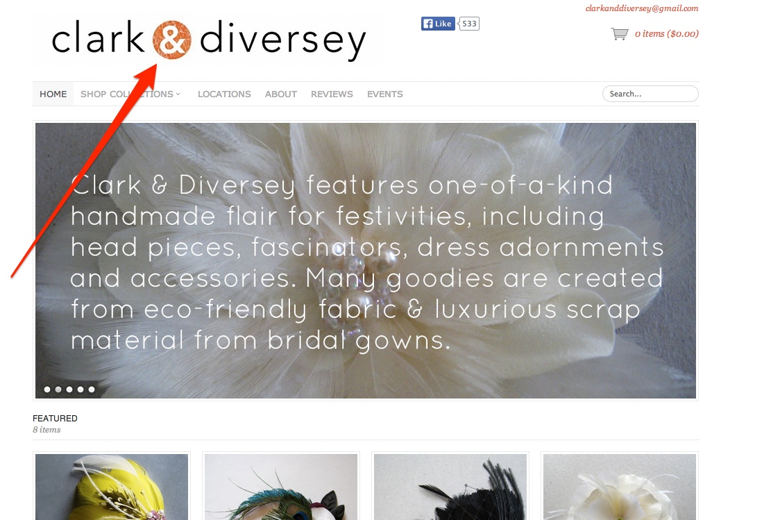
Clark & Diversey use bold and large logo to convey the name behind the brand.
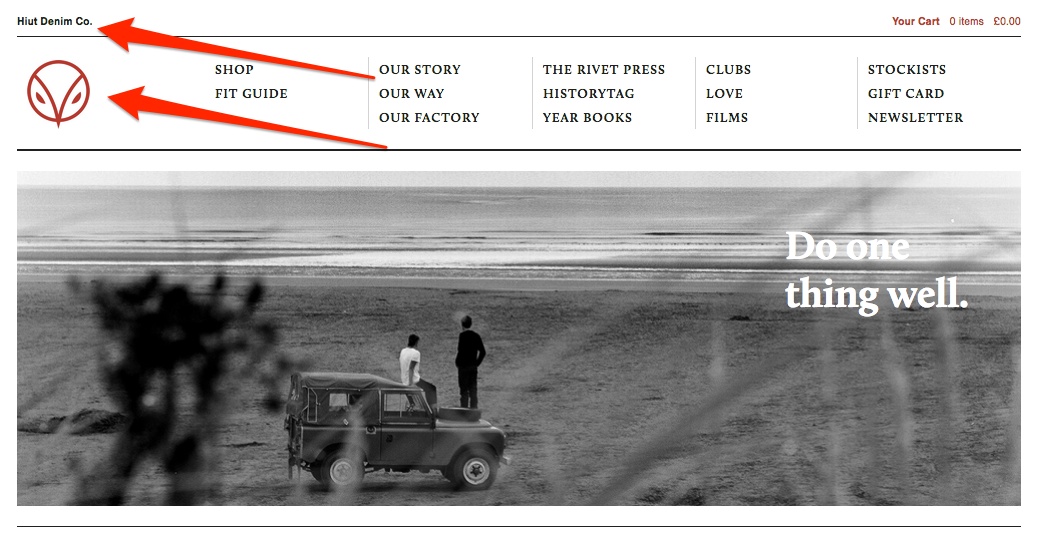
Hiut Denim Co. on the other hand includes their name in small typeface at the top of the page. Their logo however prominently identifies the brand.
What you sell
The first thing every customer will want to determine is whether you sell products they are looking for. But since you have only few seconds to indicate that your visitor you should go beyond just mentioning the name of a product in your headline.
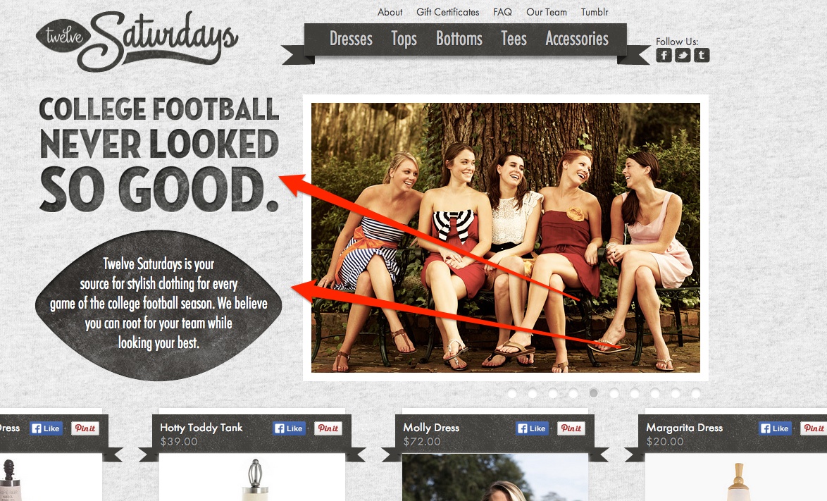
TweveSaturdays do it by displaying a very clearly noticeable information about their products. Together with a prominent products categories menu it quickly informs the visitor what do they sell.
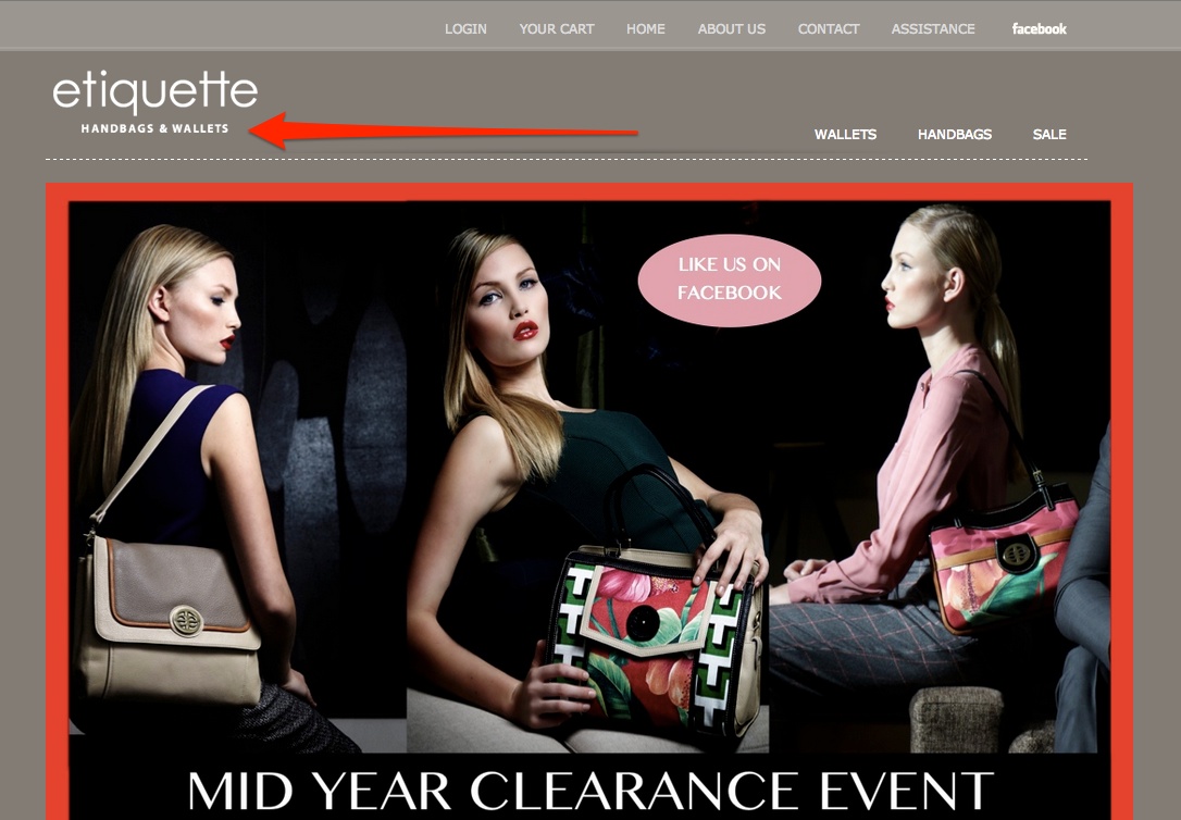
Etiquette on the other hand communicates it in their tagline. But since there are no other elements around it (and the tagline is short as well), information about products they sell is prominent and noticeable:
What makes you different
These days, with fierce competition in ecommerce, you really need to differentiate your business from your competitors. This is what customers are looking for, a reason to buy from you over your competitors.
Your unique selling proposition (or USP) has to be a specific and unique promise you make to the customer and one they will hold you accountable for.
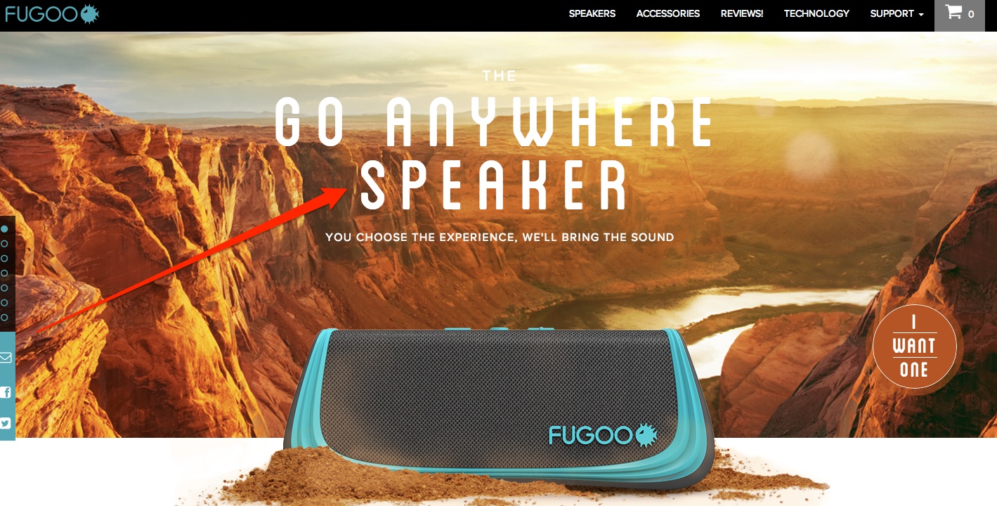
Fugoo states very clearly what makes their speakers unique on the market. And they make that statement a prominent element of the page.
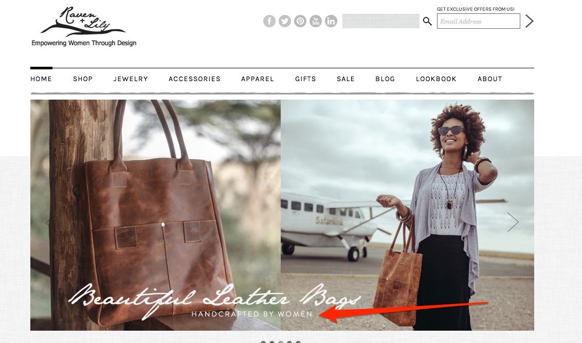
Raven + Lily promises that their products are “handcrafted by women”. This USP works especially well with their business tagline: “Empowering women through design”
Who is the audience for your products
Your visitors landed on your site looking for a solution to a particular problem or with a specific need. The first thing they will want to establish then is if you offer products that can help them solve their problem.
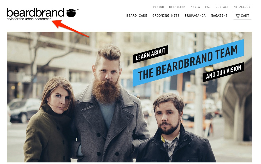
Beardbrand makes it very clear who their products are for in their tagline:
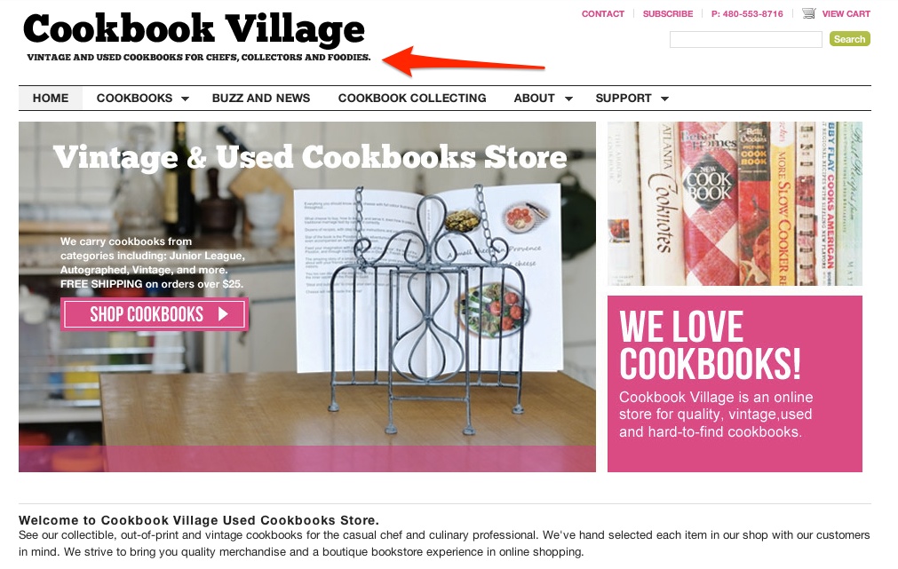
Cookbook Village not only included their audience in their tagline but also the information about products they sell:
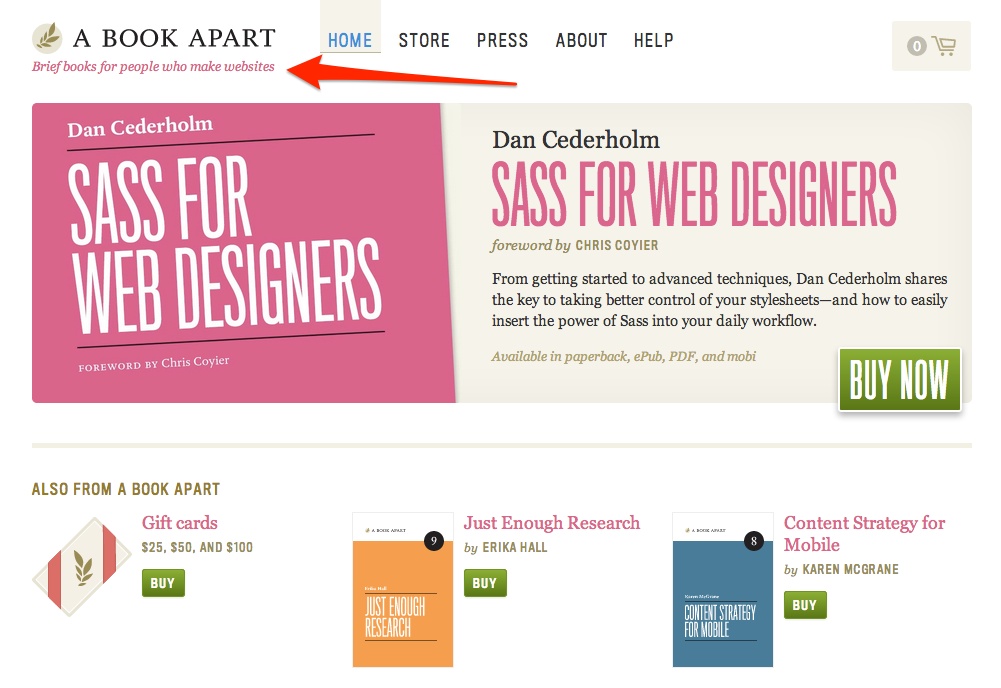
A Book Apart however makes it more implicit by stating they sell books for “people who make websites”. The information immediately implies someone involved in web design but doesn’t limit it to web developers only, for instance.
Your credibility
Trust is everything in online retail. It’s hard to convince visitors to buy from you without first establishing at least a foundation for trust. Showcasing your credibility is one of the ways ecommerce stores use to achieve this. They do so by displaying a number of various elements on their homepage:
Social Proof
Many customers react positively to social proof. Displaying a number of people who liked your site for instance, or any other metric that confirms your popularity is a way to build your credibility.
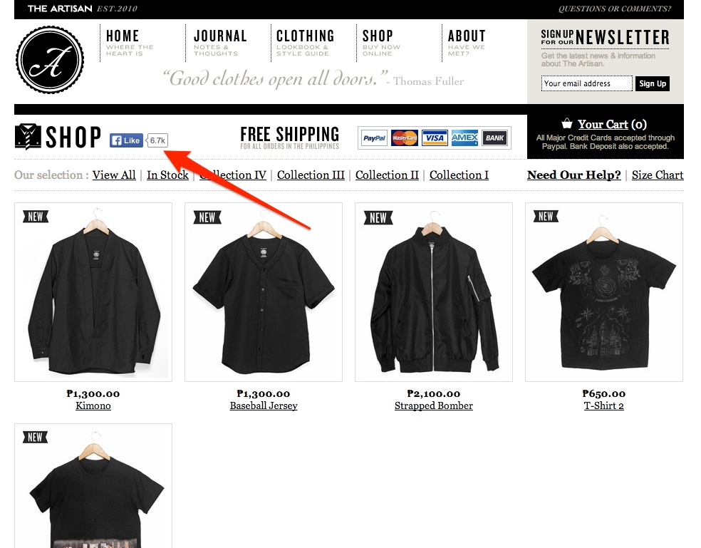
The Artisan Clothing displays their number of Facebook likes on homepage.
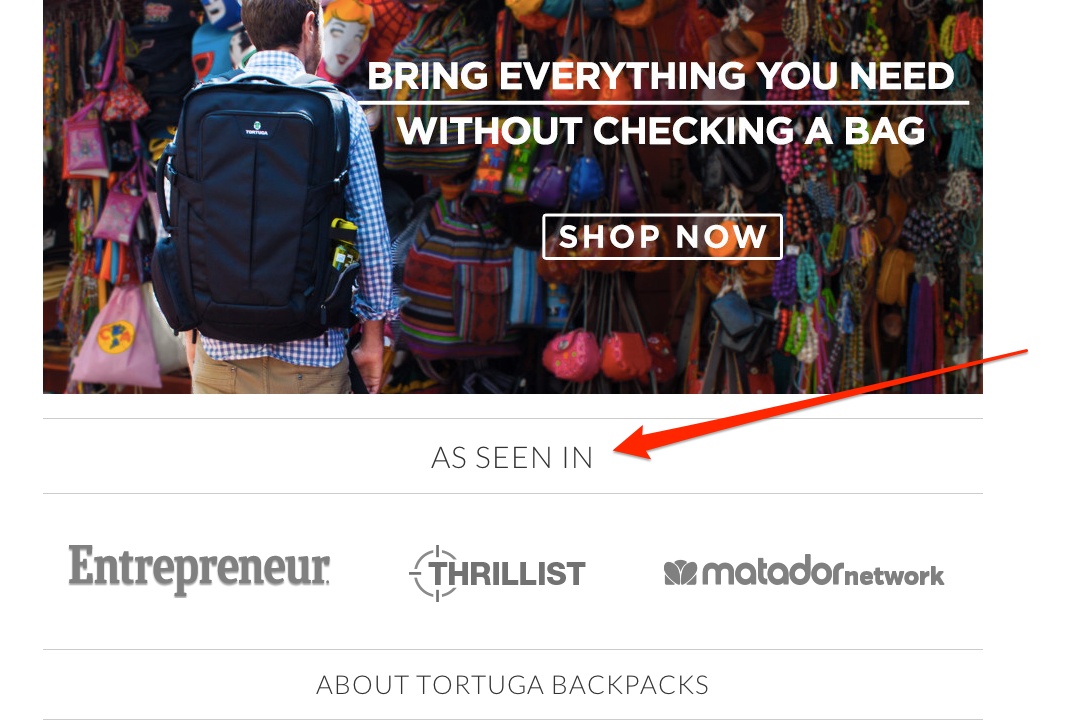
Tortuga on the other hand presents media they were featured on, using this as a social proof of their credibility.
Awards
Have you won an award? Has your product been featured in a competition, press, TV or any other media? Sharing that fact with the audience can imply the quality of the product.
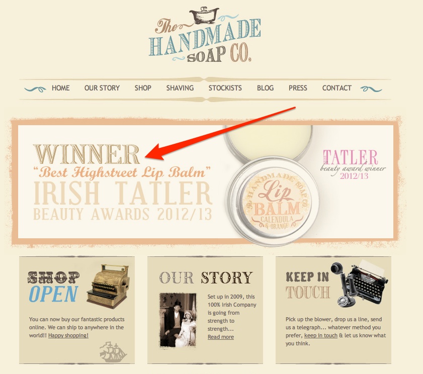
The Handmade Soap Co. displays a banner with an information about an award they received for one of their products.
Brand Cue
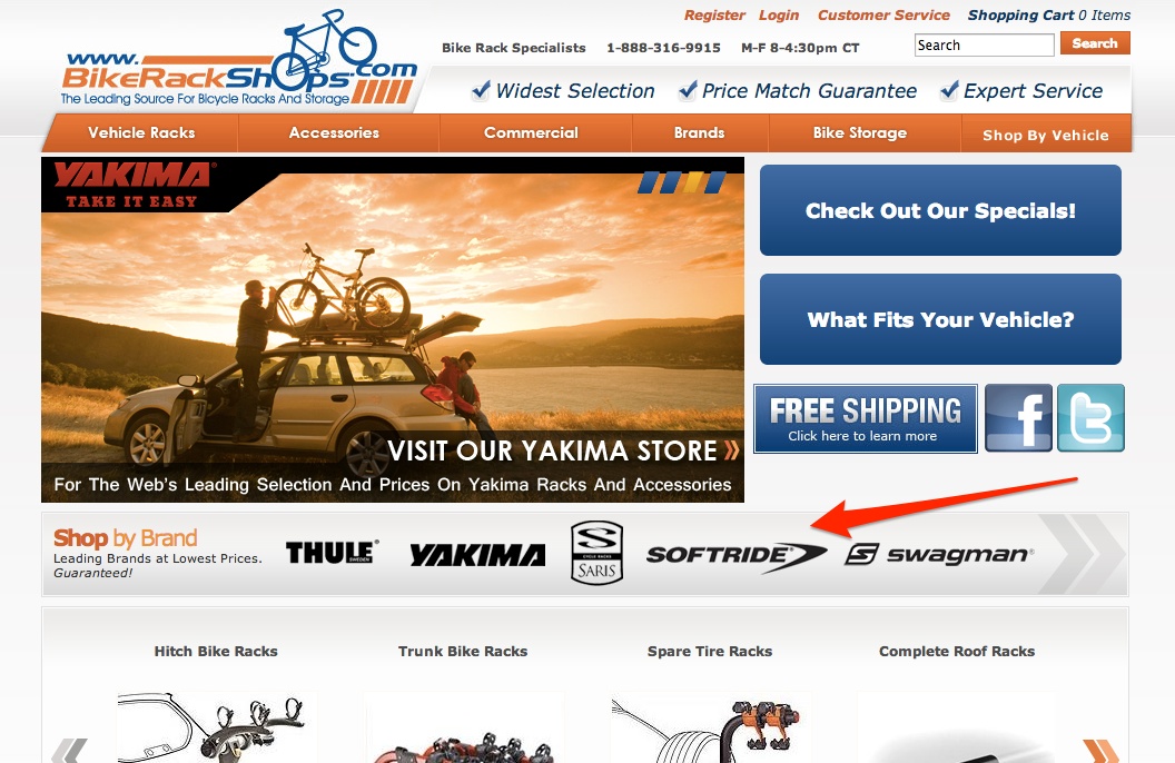
Another way to create credibility is by showing brands you work with. Customers use brands as signals of quality. They use their perception of the quality of products by a particular brand to infer the quality of your store in general.
Bike Rack Shops display a list of the most popular brands they distribute in a prominent place on the home page.
Clearly displaying contact information
Nothing builds trust online better than a company that’s actually located somewhere and one that can be reached. Strangely enough however, many shops avoid displaying even the most essential contact information on their homepage.
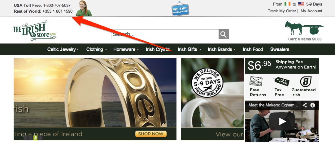
The Irish Store however displays not only a list of useful phone numbers on the left side of the header:
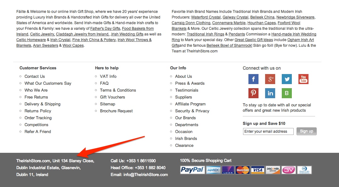
but also their full address in the footer, immediately giving the impression of a credible and “real” company.
Creative commons photo by Daniela Hartman / Flickr


