The Beginners Guide to A/B Testing in Ecommerce
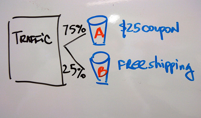
Here’s a million dollar question, which button your visitors are more likely to click, green or red?
Of course it’s impossible to guess. Even with research suggest the best option, if you dig deep enough, you will find one claiming the other color is better.
That’s because all customers are different.
People buying from you will react to various elements on the site in their own, special way. And the only way to know what works best for them is by testing their behaviour.
How? By conducting A/B tests.
For over a decade A/B testing has been a staple of marketing research conducted by various companies with a single goal in mind: to improve online conversions and achieve growth.
What is A/B Testing
Simply put, A/B Testing is a way to figure out what various website elements will trigger positive action on your web users.
During the test you measure two versions of the same element to determine which one is more successful. When testing, say a color of a buy now button, you display one color to half of your visitors while the other half sees the other variation. By measuring clicks each button received you can quickly establish the best color and implement for real life use.
Thanks to A/B testing you can take guesswork out of your website optimisation and make data-backed decision in relation to various elements of the site.
How to design your first A/B test
One of the biggest challenges with A/B testing is designing an actual test. Since you can test pretty much anything, a color of a buy now button, an effect of having a trust seal or a phone number prominently displayed on the site or a Call to Action copy, it is hard to decide what your first test should be.
But since A/B testing is in fact a scientific process, it shouldn’t be based on any wild guesses. Instead, VisualWebsiteOptimiser recommends to design your test by following a structured Scientific Method that looks like this:
- Define the problem. Ask yourself if any metric on your site (i.e. bounce rate) is higher/lower than industry average to spot potential problems that need improving.
- Research your visitors behaviour. Use Google Analytics to pinpoint what users behaviours might contribute to lower/higher metric against the industry standard.
- Construct your hypothesis. Based on the research, identify an element you want to test, i.e.: “adding more in-text links will reduce the bounce rate”
- Calculate how long you should run the test for. Depending on your website’s traffic, it may take a while to gather enough results to determine the winning variation. You can calculate how long you should run the test for by using this A/B Test Duration Calculator.
- Set up your test. Create both variations of the element and start the test. You can use various software for it. I am going to list some of them at the end of this post.
- Analyze the data and draw conclusions. If changing the element provided desired results (i.e. bounce rate went down), then implement it for all site visitors. If on the other hand there was no difference, go back to step 3 and construct a new hypothesis.
Some Ideas for Various A/B Tests
- Location of a Buy Now Button
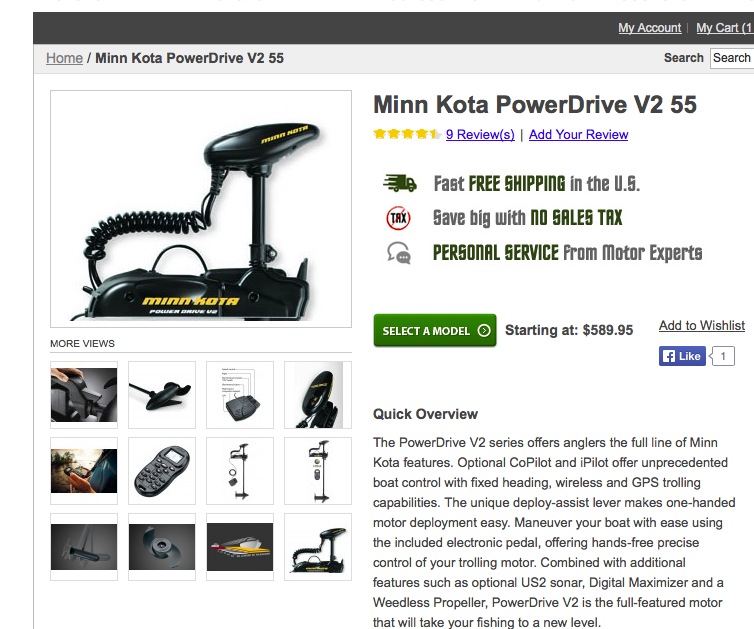
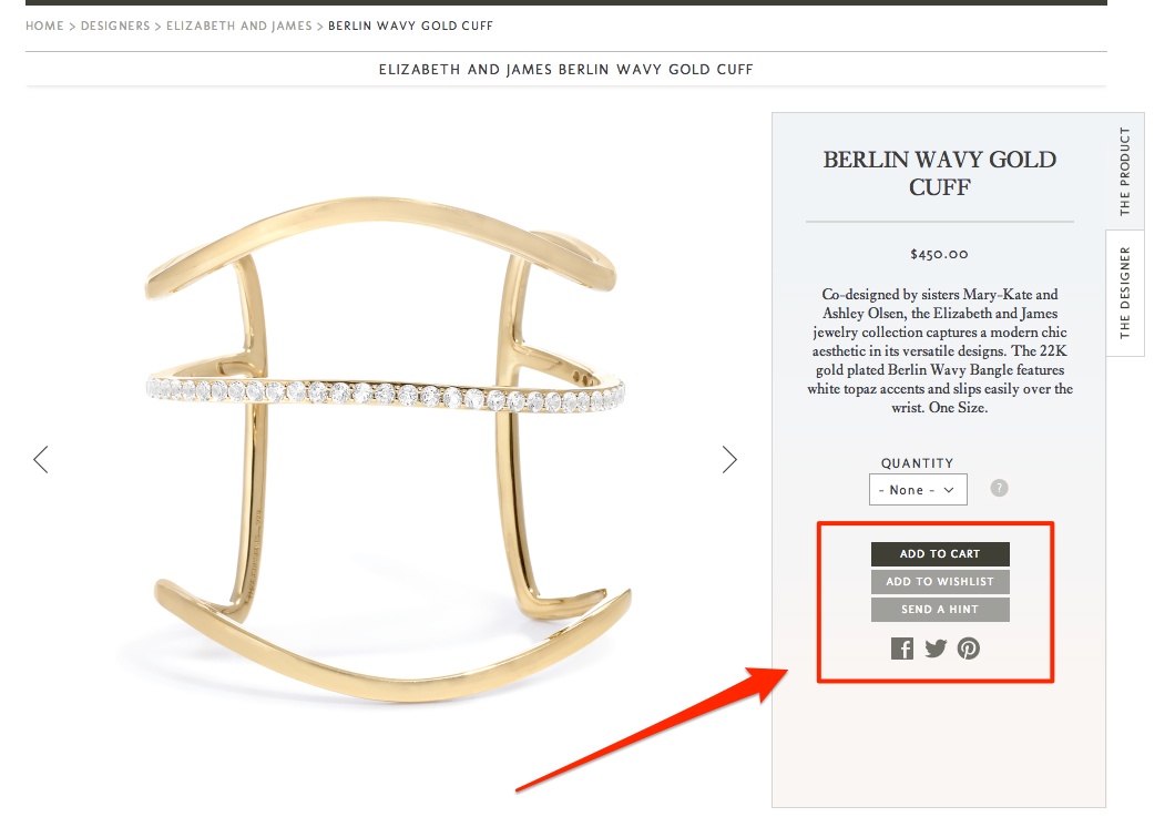
The placement of calls to action is crucial for drawing the eyes of visitors. Therefore to increase conversions you may try to test different locations of a Buy Now button for instance.
Trolling Motors display it right beside the main product image and underneath their benefits.
Stone&Strand on the other hand features their Buy Now button in a sidebar.
- Urgency Factors
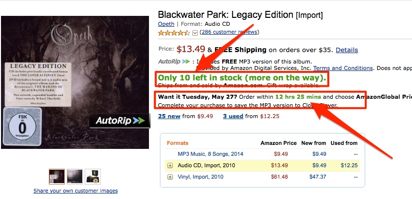
Urgency is often used to stimulate impulse purchases or move the user to select your store. Amazon use urgency to increase impulse purchases.
- Product Videos
Product videos offer the closest experience users might have with a product before purchase. They help them imagine how the product will feel when they have it in their hands. Halfords use videos to showcase their outdoors camping equipment.

- Trust Seals
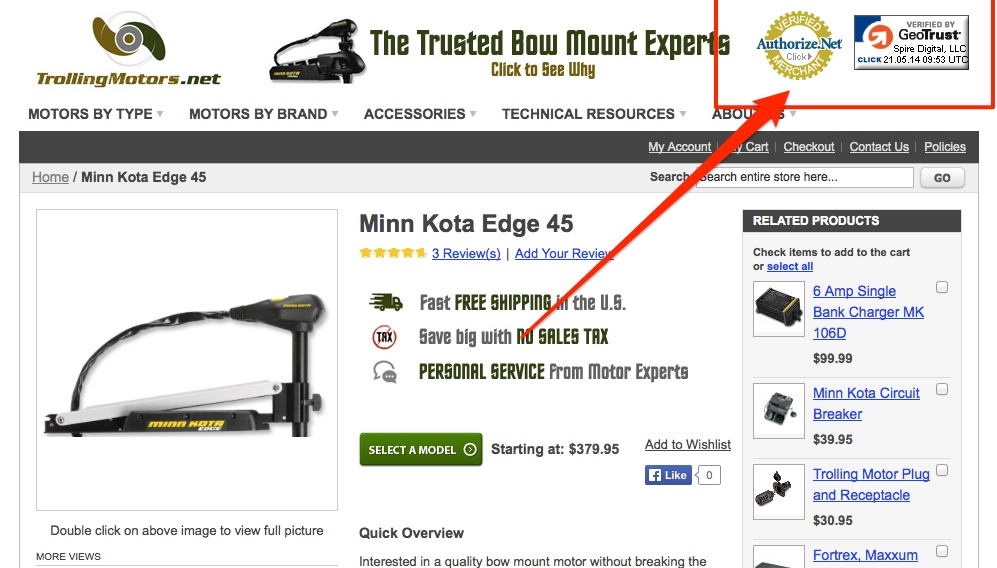
Trust seals are known to increase customers trust in a brand and overcome one of the filtering factors – security concerns. TrollingMotors use 2 seals in the header of their site.
- Shipping and Return Information
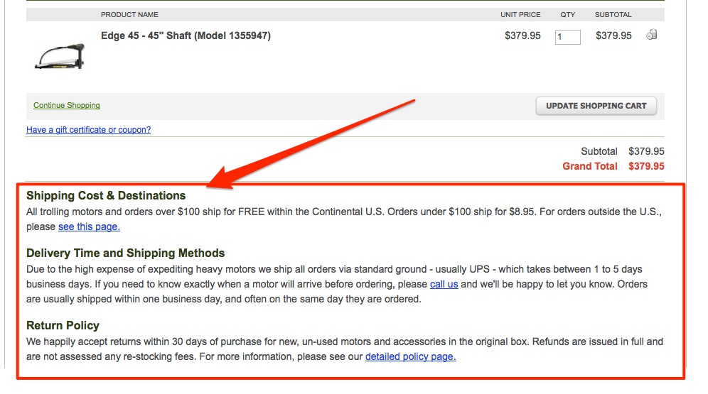
Trolling Motors display their shipping, delivery and return information in the cart instead of hiding it somewhere on a FAQ page.
Typical Mistakes with A/B Testing
Due to a complexity of the testing process, there are some common mistakes many web masters make. Here are some of them:
1. Random Testing
We’ve already talked about the importance of planning your tests carefully and backing your decisions with industry standards and research. Yet picking what to test at random is still the most common mistake.
2. Sacrificing Your Brand for Higher Conversions
Your brand is your most valuable asset. Yet, for many online retailers the amount on the balance sheet often comes first. This only hurts their brand in a long term. When designing your tests make sure that you do not do the following:
- introduce non brand elements to the site
- keep on changing your USP or brand promise – it will only confuse your customers about who you are.
3. Testing too small things
For an A/B test to deliver results you need to test elements that offer at least some significance. Changing one word in your product description is likely to have any affect on conversions. Changing the entire description on the other hand might.
4. Performing tests on pages with too little traffic
It is impossible to use A/B testing without traffic. You should have at least couple a hundred visits a month to a page and 50 conversions to be able to see any effect of the change you make.
5. Running too many tests at the same time
Once you start testing various elements and seeing results it is easy to get tempted to run too many tests at the same time. The problem is that when your testing concludes you might not be able to tell which of the changes brought the actual result.
How to Establish If Test Results Are Significant
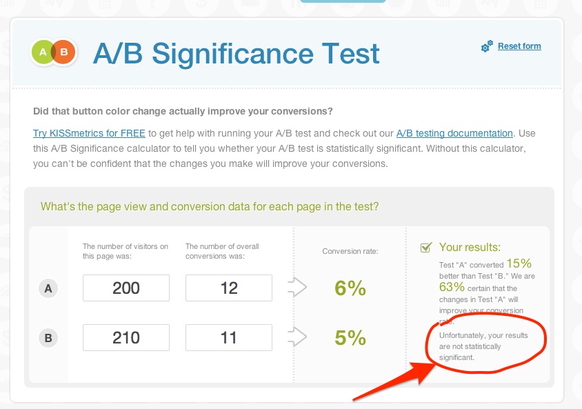
Not all results of your tests will have any significance. A tiny difference between one variation and the other might be too small to be considered a change. As Brian Whalley puts it: “if the difference between tests is very small, it may be that the variable you tested just doesn’t influence people who are looking at it.” Therefore before establishing the success or failure of your test you need to establish the significance of your results.
There is a number of significance calculators online. This Get Data Driven one is really simple to use. Just plug the number of people who saw each version of the element and conversion of each elements to see your result.
A/B Testing Tools
Lastly, A/B testing is conducted with the aid of specialist software. Here are few of the most popular tools:
Optimizely: An simple to use platform for simple and advanced A/B tests.
Visual Website Optimizer: Another simple A/B testing tool but offering some advanced functionality as well.
Unbounce: Unbounce is a landing page creator however it offers A/B testing functionality as well.
Creative commons image by Marc Levin / Flickr


Good points there, urgency factor is really important if used right.
Thank you for the intersting guide – I have recently tried A/B testing for my Woocommrece porducts, but it turned out that standrd Googe 2 weeks testing is long enough, especially if you want to test many different things. How do you think, what time would be optimal for product A/B testing? Or maybe it has sense to measure it in traffic numbers?