8 Ideas for A/B Testing Your Product Pages

You’ve put a new product page together.
You included trust seals and other elements bound to improve conversions.
You took killer pictures and worked out an irresistible deal.
And now you check the stats.
No change!
Your conversion rate hasn’t improved a bit.
You consider looking for more ideas but even now it seems you’ve tried everything you could.
Or have you?
I’m sure you know of the importance your copy plays on conversions. But do you know that you rarely get it right the first time?
Headlines, product descriptions and other text on a page influence your customers to take action-or abandon buying your product altogether. And sometimes the only way to find out what works is through testing.
A/B Testing a Product Page Copy – What to Test
Often the biggest challenge with running an A/B test is deciding what to test. Below are some ideas plus successful tests examples.
Product Headline
Headline is the most important element of your copy.
- It’s the very first sentence your visitors see.
- It tells them if they’re in a right place. Headline reassures visitors that a page contains what they’ve been looking for.
- It communicates the basic value proposition. At least it should also tell them the main benefit of buying a product.
Test different headlines, include only a product name or extend it with a value proposition. Or present the value proposition only.
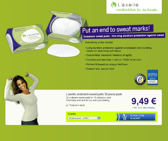
L’Axelle for instance discovered that changing the headline to action oriented value proposition – “Put an end to sweat marks” enticed 93% more people to click on their add to cart button.

(Winning L’Axelle’s headline)
Value Proposition
Value proposition answers one crucial question every new customer is asking:
“What makes your store different from anyone else selling similar products?”
“A value proposition’s an explicit promise of value to the reader about whatever you’re selling – a promise of something amazing, hopefully. It should quickly separate you from your competition. It should also communicate something highly desirable to your target audience. And it needs to do a lot of heavy lifting (without feeling heavy), and so a great value proposition typically requires more than a few words.”
Most stores communicate their value proposition on their home page.
But do you communicate it on your product page as well?
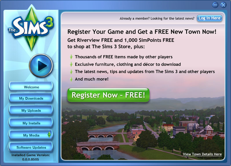
Wildfunnel for instance discovered that adding a clear value proposition to The Sims3 landing page increased conversions by a staggering 128%!

Product Description
Words you use to describe products often make or break the sale.
Your customers can’t see or touch the product. The only way they can learn its benefits is through what you communicate to them.
You can’t advise customers in any other way than with copy, either. Sure, there is always an option to live chat but visitors rarely use it for these purposes.
Test what copy works best for your customers, for instance:
Test How You Communicate a Product’s Key Benefit
Your product solves a particular customer’s problem.
Knowing that problem is one thing. Communicating it is a different challenge.
Test the way you display the main benefit of your product.
- Include it in product headline.
- Use it in sub headline.
- Start product description with it (and test it in bold or highlighted in any other way).
Test Format for a List of Features
It’s true: benefits sell.
But features help overcome final sales objections. And the way you display a list of product’s features can affect your conversions.
Consider testing various placements and formats:
- Bulleted lists.
- Bulleted lists with short explanations.
- Short explanations in the body copy and so on.
Page Length
This test proved that content’s length affects both rankings and conversion.
But you don’t always have to keep all content visible to a visitor.
DesignBoost, for instance, found that creating a shorter page increased their conversions by 13%. For Crazy Egg however, displaying all information at once increased conversions by 30%.
Therefore, test various page lengths.
TIP: Tabs prove invaluable when you have to display a lot of information but want to keep the page short.
Technical data, mounting or installation and usage instructions can take a considerable space. They can also distract your visitors from the most important part of the copy – product’s benefits.
Therefore, test different lengths of your page. Various studies have proved that depending on your product and audience, pages of different length perform better.
Testimonials
For many online retailers, a testimonial isn’t part of a website copy. And yet, these few lines of text often have a profound impact on visitors.
How? They give them an assurance that someone else had success with dealing with you.
For example, WikiJob discovered that including proper testimonials and attributing them to customers by name increased their conversions up to 34%.
Call to Action
After headline, call to action is undoubtedly the most important element on a product page.
It tells a visitor what you expect them to do.
But you can get your call to action button copy wrong.
TextMagic for instance discovered that including the word “Buy” had cost them lost conversions. As they explain it, when people see that word on a button, they immediately assume that once they click it, they’ll be charged.
In reality however all that’s going to happen is that their product will be added to a basket.
Similarly, this anonymous Danish company saw over 38% increases in sales after changing one word in their CTA.
In this post, Optimizely lists various ideas for A/B testing ecommerce calls to action, including suggestions for testing copy as well.
In short, product page copy affects conversions as much as product image or presence of trust seals. But you should A/B test various copy elements to find out what engages your visitors the most.


