7 Ways to Improve Checkout Experience and Reduce Cart Abandonment

You know…
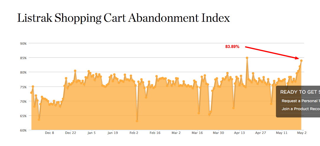
According to Listrak’s daily report, the shopping cart abandonment rate is at a staggering 83.89%!
And even though the average for the last 6 months is lower, at 76%, it still means that, statistically, at least 76 out of 100 people will abandon purchases at your store.

Yikes.
But, according to BI Intelligence, you could potentially recover up to 63% of those sales. How? By improving your checkout experience, for one.
The most common reasons for shopping cart abandonment.
Did you know that at least 8 of 14 most common shopping cart abandonment reasons are related to poor checkout experience?
(Source: Statista)
Unexpected costs, complex and lengthy process, security concerns and many other factors prevent customers from completing the order.
It therefore goes without saying – by improving your checkout experience you can increase the amount of completed orders and thus, generate more income.
And here are some suggestions how to achieve it…
Make Your Checkout Mobile Friendly
It’s scary: 88% of Americans experience negative issues while shopping on their smartphones.
51% find online stores harder to navigate on mobile than desktop.
46% finds images too small to help them make a buying decision.
And 26% agree that mobile checkout process is problematic.
Other issues reported by Skava include concerns over data security, website speed on the smartphone, and difficulties in adding coupon codes.
As a result, 33% of shoppers immediately defect to a competitor after such negative experience.
With mobile traffic already exceeding visits from desktop in some industries, these are certainly numbers not to ignore.
If you’re website doesn’t feature fully mobile-friendly checkout, invest in one right away.
Make sure that your customers can not only browse products but also complete the entire purchase process from their mobile devices.
For inspiration, check out Econsultancy’s list of 10 of the world’s best mobile commerce checkouts.
Allow for Guest Checkout
Imagine… you’re at work, trying to buy a last minute gift for your spouse. You’ve forgotten about that special occasion and this is truly your last chance to get out of trouble.
But just as you’re about to complete a purchase….BAM! The site hits you with a long registration form.
Aaargh!
All you’ve wanted was to make a quick purchase when your boss wasn’t watching and now you’re stuck…
What do you do?
It’s quite common for stores to require registration before completing a purchase. There are however certain problems with this approach:
- Registration takes time. With many users wanting to complete the order as quickly as possible, it could deter them from completing the purchase.
- Many customers would also have concerns about setting up an account. They might fear that you’ll start bombarding them with unwanted marketing messages or generally don’t want to have to remember yet another set of login details.
As a result, many of them will abandon checkouts that force them to register for an account.
To overcome this, offer an option to checkout as a guest, in which a customer could complete a purchase without having to go through a process of setting up an account.
Remove Unnecessary Fields from the Checkout Form
Even if you allow checkout as a guest, the length of your checkout form might still defer users from completing a purchase. As a general rule, the shorter your checkout form, the greater the chance of a customer to completing a purchase.
Shorten Your Checkout to a Maximum of 4 Steps
It’s tempting, I know…
While a customer is filling the checkout form, you might want to ask them to subscribe to a newsletter. Or promote complementary products in hope they’ll add them to their cart.
Airlines are known for this, pushing insurance, car hire, or hotel bookings into their checkout forms. But every step you add to the checkout only impedes your chances at getting the sale.
To prevent this, shorten your checkout to a maximum of 4 steps:
- Product Details,
- Shipping & Billing Address,
- Payment,
- Review & Confirmation.
Show Trust Seals
In 2011, Econsultancy asked their users how they decide whether to trust a site when shopping on it for the first time.
A staggering 48% of respondents said they’re looking for trustmarks.

But what are trustmarks?
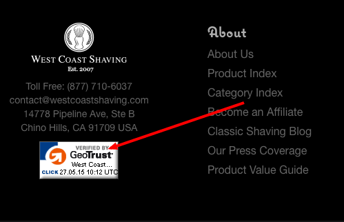
Trustmarks are logos confirming that a business is authentic and its website has been tested and is secure.
You’ve probably seen them on many online stores you buy from. Here’s an example of a trustseal on WestCoastShaving website.

Here are two things to consider when selecting a trustmark to apply for:
In their research, Econsultancy discovered that the most effective trustmark to use is one your audience already knows.
A 2011 study by Actual Insights the most effective badges come from well-known brands – MacAfee, Verisign and Paypal (but that’s providing that your audience is familiar with them).
Show Product Images
You wouldn’t believe how many customers make accidental purchases online.
Someone wanted to buy one product but then by accident added another to the cart. Or never paid attention to product specification and as a result bought a wrong size.
But without a product thumbnail on the checkout page, customers often find out about their mistake when the product arrives at their door.
Yuck!
Therefore help them be certain that they buy the right product by including product thumbnails on the checkout (and cart) page. This way they’ll be able to use visual cues to confirm that the product in the cart is the very one they wanted to buy.
Offer Multiple Payment Options
A 2000 survey by Retail Technology Review discovered that 50% of British online buyers would abandon the purchase if their preferred payment method weren’t available.
I agree, this might be an out of date data. But one could argue that this number is much higher today. Therefore, to prevent losing customers, offer as many payment options as possible.
PracitcalEcommerce suggests offering at least these payment methods:
- Mastercard,
- Visa,
- American Express,
- Paypal,
- Amazon Checkout.
And, That’s It!
Not all of these suggestions are simple. But implementing even one of them could have a significant effect on the number of completed orders in your store.


