4 Tips on How to Choose the Best Theme for Your Ecommerce Store
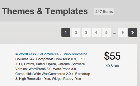
Starting an e-commerce store nowadays is pretty simple, at least compared to ten years ago. You can be up and selling within a couple of hours for a few dollars. Some companies however, get stuck on one crucial element of launching: the website design.
The design of your website is really important and something that business owners take great pride in doing well. To balance the need to launch quickly, one of the best choices in the beginning is to take advantage of pre-design website themes. You can usually buy them for $30-$60 and save thousands of dollars and headaches.
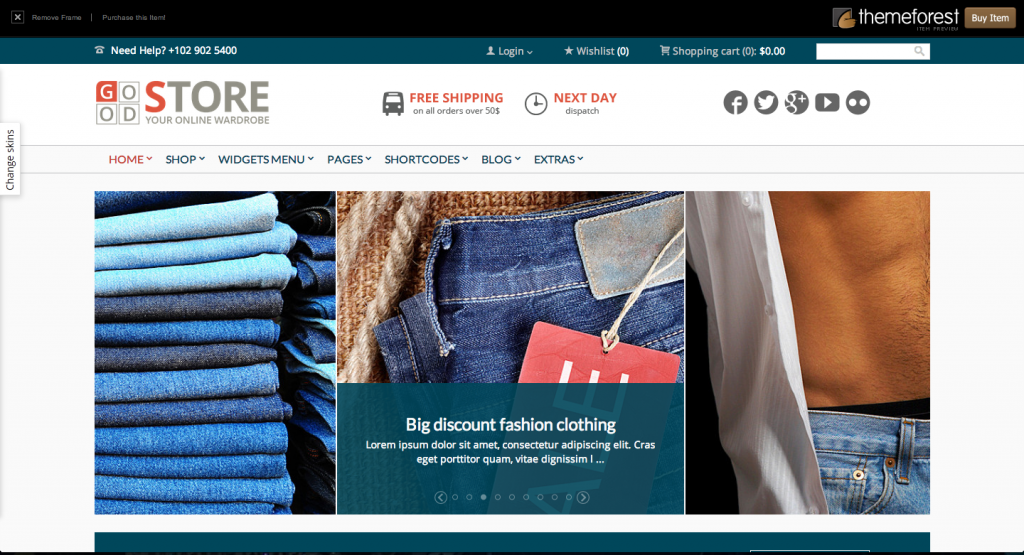
For those who aren’t too familiar with pre-design themes, they are simply templates that you can import to popular platforms like WordPress. They come with all the bells and whistles of a modern website and look great. The only downside is that hundreds of people buy the same theme. However, its rare to find someone else within your industry with the same theme since there are thousands of unique themes.
If you don’t think you can buy a website theme that looks good for $60, then take a few minutes to look at the following links:
Sample Theme 3
Most of these themes are also really powerful. You can literally change anything about them such as where columns appear, how products are displayed and anything else you can imagine. Platforms like WordPress and Shopify have made all of this really easy, even for non-technical people.
How Do I Choose the Right Theme?
Once you start searching for e-commerce themes, you will realize that there are hundreds of choices, more than you can go through. Let me cover some tips that should help you narrow down your options.
1. Looks Great in Mobile Phones and Tablets
With everyone using mobile phones, there’s no excuse why your new website you should look terrible in smartphones and tablets. You also shouldn’t buy a theme that doesn’t play nicely with mobile devices. You want to look for the following words in the title or description of the theme:
- Responsive
- Fluid
- HTML5 & CSS3
2. Easily Customizable
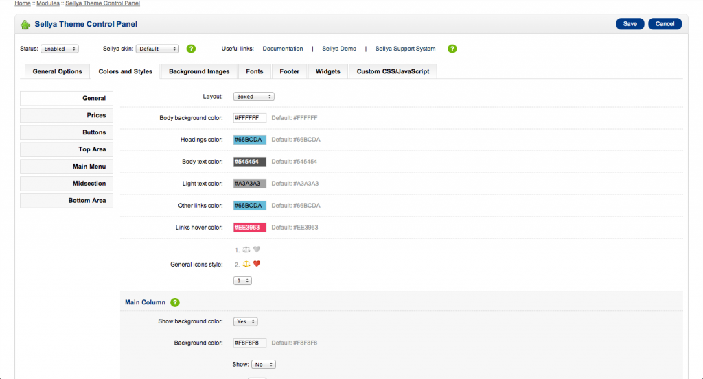
New themes also have backend tools that let you do everything without ever knowing how to code. Look for themes that talk about unlimited color combinations and applying hundreds of background patterns, all through an admin panel.
A good example of a theme that does this is:
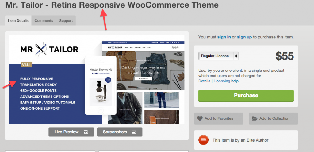
Theme With the Right Description
You can see how the description talks about “extreme customizations” and hundreds of options. This usually tells you that theme is pretty flexible.
A bonus point is when they offer a username and password to access the admin panel. Use it and see for yourself what kind of options you have.
3. Flexible Options to Display Content
Another thing to look for is an endless ability to display content in whatever format you want. Themes will usually include some pretty cool ways to display your products but you don’t want to be stuck with a format that perhaps doesn’t convert customers too well.
While this changes for different platforms, themes will talk about how you can change how many columns you can use or how many different product layouts exist. For WordPress, great themes will have hundreds of “shortcodes”. Shortcodes are just a way to display content anywhere in your site without having to touch any code.
4. Great Technical Support
Finally, a theme may look great but it may also have bugs that you just can’t see. This is where great customer support comes in. It’s hard to judge good customer service but there are couple of things that can tell you how dedicated a theme creator is.
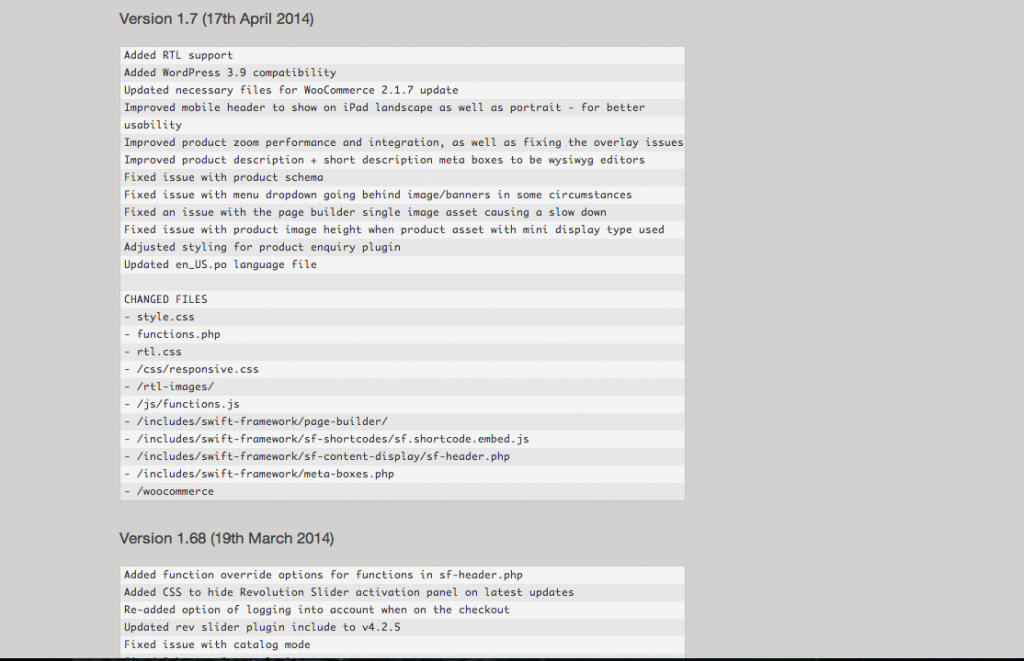
First, look at when the theme was published and how many times the theme has been updated since then. Take special note of when this theme was updated last. You don’t want a theme that hasn’t been updated in more than a year because platforms change and can break how a theme looks.
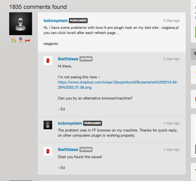
Second, some sites offer a comments section where people who purchase the theme can ask about how some things work. Read the comments and notice how the theme creator responds to them, if at all. This can give you a good idea of how he/she will respond to you if you have a technical question.
Use the above tips to narrow down your options into 2-3 theme that you like. Once you have a few solid options, play around with their admin panels and see which one you feel most comfortable. If you have any questions or comments, let me know in the section below.
Tagged branding, product catalogs, website design


