
Mobile Marketing Chicken & Egg
Many retailers are reluctant to invest in a mobile version of their website. Their mobile traffic is minuscule and conversion rates stink. They are smarter than to invest tens of thousands of dollars just to be trendy.
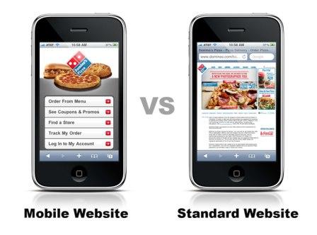
Here’s the problem with that logic: Your poor mobile user experience is the cause of your poor mobile traffic & conversion rate. Mobile traffic to your desktop website will never perform well enough on its own justify a site upgrade. Instead, take your poor performance as a sign that it may be time to invest in a mobile website.
Google is all about user experience, so they will give you a better quality score if you direct AdWords mobile traffic to a mobile website. This means that, all things being equal, mobile sites are given more AdWords traffic without paying a penny more for clicks.
But you’ll probably be willing to pay a lot more for mobile traffic. Mobile sites are almost always better at converting visitors to buyers. A 5x improvement in conversion rate isn’t uncommon once you turn on the switch to your mobile website.
But first, how does your current site look on a mobile device? Google built a clever tool to show you. Their “GoMoMeter” gives you a short quiz and shows you a mobile screenshot along with stats relevant to mobile users, such as load time.
Load time may be a bigger issue than even site design. KISSmetrics reports that 47% of consumers expect a web page to load in 2 seconds or less and 40% of people abandon a website that takes more than 3 seconds to load. Given that mobile data speeds are much slower than desktop, a mobile site must be optimized for usability AND load time.
Online retailers using one of the popular hosted shopping cart platforms, such as BigCommerce, may find that they’ve already got a mobile site version built-in, albeit without the design customizations present in their desktop site. Others will need to price out a mobile design/development vendor to start the process. Your original site vendor will probably be more than happy to take on the project.
Keep in mind that the latest trend is to have a single ecommerce site design that responds dynamically to the screen size. This is called responsive design. It’s a bit more work on the frontend, but if you’re lauching a new site design anyway, it’s probably the way to go.
Google put together the following graphical explanation of responsive design. Notice that an additional benefit of responsive design is that you get a “version” of your site for tablets too.

Mobile traffic continues to increase — it has more than doubled in the last 12 month alone! Now is the time for you to get your mobile commerce house in order.

Chris Crompton is the Group Marketing Manager at ROI Revolution, a retail-focused digital marketing agency.


One thought on “Mobile Marketing Chicken & Egg”
Leave a Reply


Pingback: Mobile Shopping Payment Methods Nightmare Solved in 2 Steps | eCommerce Insiders